Components
User interfaces are composed of reusable semantic elements called components. Each component is specified by a set of documents: model.txt, preview.xd, components.xd, layout.xd, user_flow.drawio, and use_cases.drawio. This page covers the components.xd document.
components.xd lists all children for the component. Children may be omitted where there is no customization done and their inclusion is made clear from layout.xd . If the component has no children (e.g. it is primitive or purely layout) then components.xd is omitted. Most components will require components.xd.
Contents
Component Breakdown
The question of when to define a component on its own rather than as a child of its parent is generally one of complexity: when the child is so complex that defining it within the components.xd of the parent impedes readability, it should be split off into its own component. The following heuristics are helpful in determining whether a child should become its own component:
- It is shared by multiple parents and should be generally available in the application (e.g.
FilterPanelcould be defined inTableView, but filtering could conceivably be used outside of a table) - It has multiple children that require conditional styling (e.g.
HeaderCellcould be defined inTableView, but it has many children with lots of conditional styling that would be harder to follow alongside all the other children ofTableView) - It contains its own logic that is best described by its own model and user flow (e.g.
OverflowLabelinCategoricalList) - It contains children that themselves must have conditional styling based on their state (e.g.
ColorSwatchinColorBox)
Getting Started
components.xd comes after preview.xd and model.txt. From preview.xd, the children can be listed and the essential scenarios understood. From model.txt, specific data, styles and states can be referenced.
Example: AccountListItem
Data:
  identicon: A unique icon identifier for the account.
  id: A unique username for the account.
  name: The full name associated with the account.
The above model for AccountListItem shows 3 pieces of data. There are no component-specific states or styles described in the model. We infer that the job of components.xd will be to indicate where these 3 pieces of data will appear and how they will be displayed.
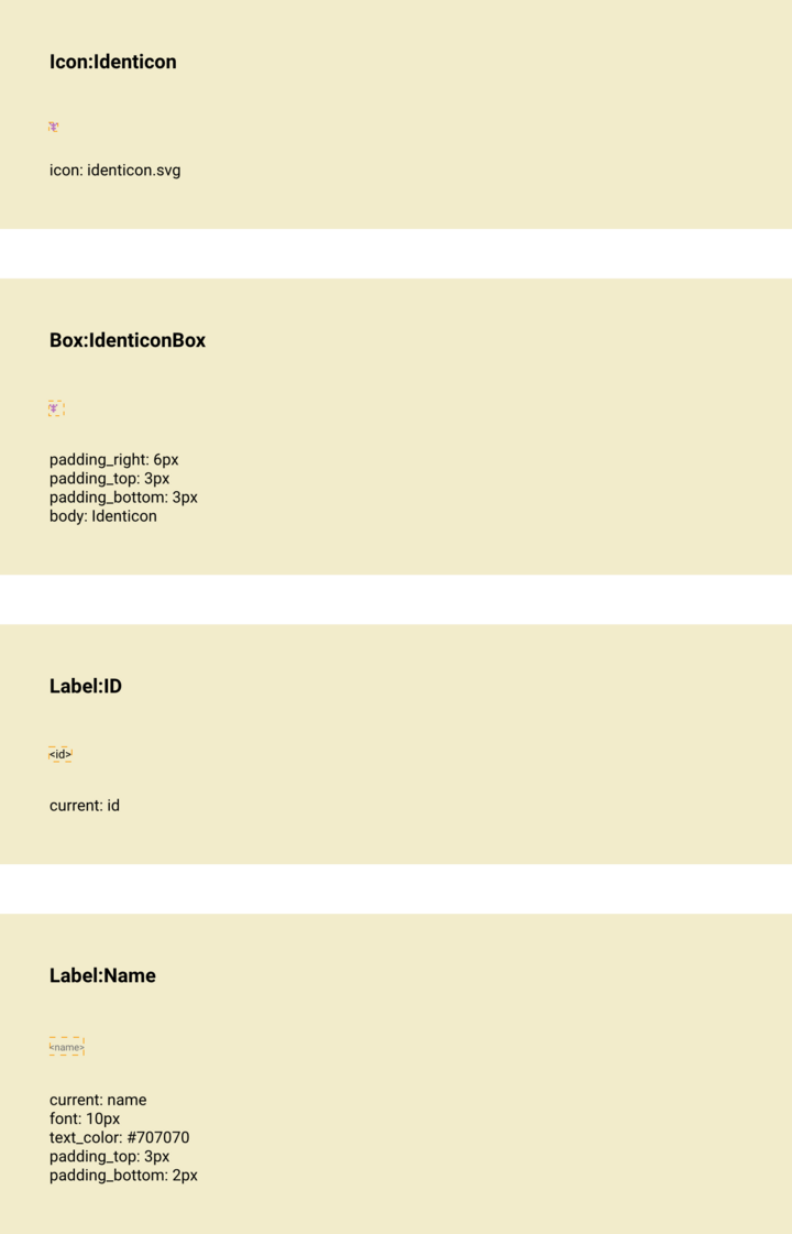
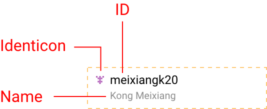
From the above preview, there are no scenarios showcased: the component appears to be display-only, without any specific interactions. There are (at least) 3 children:
IconforidenticonLabelforidLabelforname
The designer could split the children into other components (e.g. a Box) for styling purposes, so we can have more than the expected 3 children. Based on preview.xd and model.txt, we infer that components.xd will list the 3 expected children and cascade the data to the appropriate child. It should also describe the font settings for the name, which have been customized away from the default.
Reviewing the actual components.xd, that is exactly what we get. A Box has been used to contain the Icon so that some padding can be added to it. The children are siblings, so they are ordered left-to-right and top-to-bottom.
We note that id is assigned to the current property of the Label named ID: for a Label, current refers to its displayed text. Also, name is assigned to the current property of the Label named Name. At the top, identicon is assigned to the icon property of the Icon named Identicon.
It is common practice to name children by the data that they display when they are solely responsible for one piece of data. The capitalization conventions (snake_case for properties and PascalCase for components is used to disambiguate the child from the value).
Anatomy
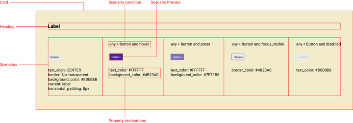
The structure of components.xd is a vertical list of cards. Each card displays exactly one child and its scenarios. Wherever possible, a visual preview of the child should be displayed for each scenario.
Example: LabelButton
Each card consists of a heading and table of scenarios for the child. Often, there may only be one scenario, the default: a condition is not necessary, but any may be used to indicate that it applies to any state. Each column in the scenario table has a condition that describes it, a visual preview, and a list of property declarations. Property declarations are how values are assigned to the child.
The visual preview is non-normative and intended only as a guide. The property declarations are authoritative so take care to get them right.
Heading
The heading is the name of the child. It is used to identify what component is being used. Any referenced component should already be defined in the specifications. If there are multiple children that are instances of the same component (e.g. two labels), they should be renamed using an alias.
Aliases
Aliases are named instances of components. An alias can have conditional styling not present on the main component. Aliases take the format OriginalComponentName:Alias (e.g. TableRow:EmptyRow). An alias is referred to by its assigned name (EmptyRow is how we refer to the child).
Aliases can be a convenient way to customize a component and reuse the customization without having to redeclare the customization for each use case.
Example: TitleBar
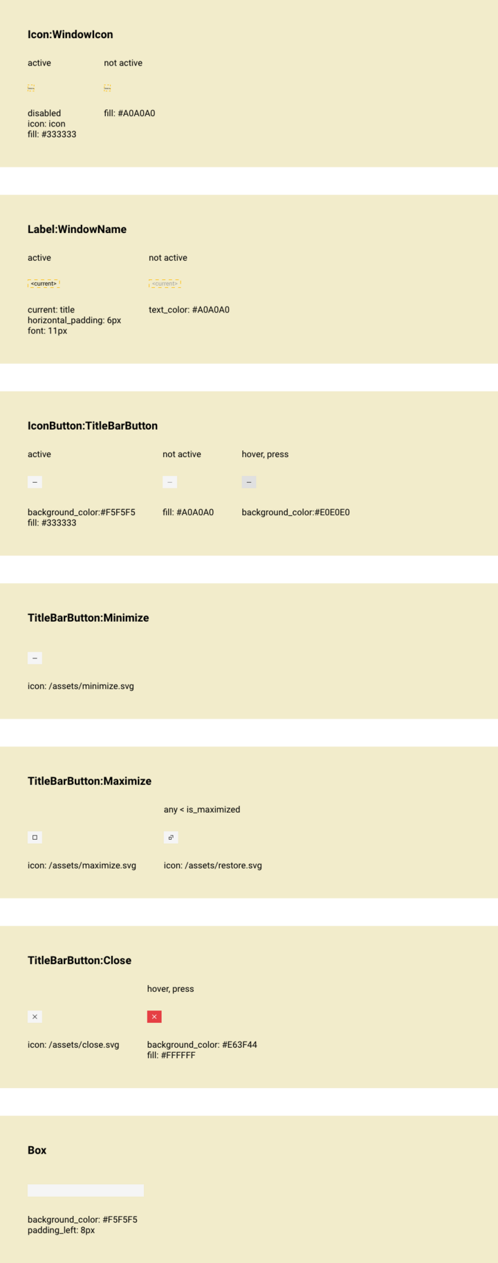
TitleBar customizes the IconButton for use as the minimize, maximize, and close buttons. Because the custom styling is shared, aliasing provides a concise way to declare the customizations.
In the example, TitleBarButton is an alias for IconButton with customizations for when it is not active and hover or press.
The buttons Minimize, Maximize, and Close are themselves aliases for TitleBarButton, with further customization for the icon and, in the case of Close, a different styling for hover or press.
Aliases make the scenarios more readable, as only the differences are listed for each alias. For Maximize, it is more clear that there is conditional styling for the icon used than it would be if all scenarios were declared on the same card.
Note that TitleBarButton is a virtual child: it doesn’t actually appear anywhere in the layout of TitleBar. The designer is free to make arbitrary virtual children provided they make the document more readable.
Multiples
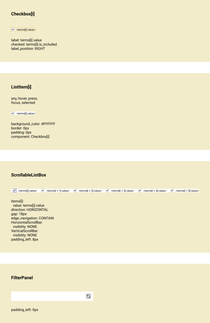
Frequently, the children of a component will be multiples of the same type, and the same conditional styles apply to all of them. In these cases, one child is given a card and it is referred to as one item in a list using array indexing (e.g. Label becomes Label[i] to indicate the ith Label in a list).
Example: ClosedFilterPanel
The ScrollableListBox contains customized ListItem. These are indicated as ListItem[i]. Each ListItem contains a CheckBox, which becomes CheckBox[i] in the card, as there are multiple checkboxes. This notation can also be used to target specific items in the list, such as only the even items (2i) or the first item (0), but such usage is rare.
Scenarios
Scenarios are conditions in which children can be in. These are like variants or states.
Scenarios are used to set properties on children. Data and styling properties are set in components.xd, while layout properties (e.g. height, width) are reserved for layout.xd.
Example: LabelButton
LabelButton has conditional styling based on whether the Button is:
disabledfocus_visiblepresshover
These conditions are the scenarios.
Scenarios are evaluated from right to left: the first scenario that matches is the one that is evaluated.
All properties declared under a scenario are applied. Any undeclared properties are inherited from the default scenario. Any properties undeclared in the default scenario are inherited from the defaults for that child.
Example: HeaderCell
Scenarios can consist of one or more selectors, which can be chained using newlines or commas to indicate or conditions.
In the example, ResizeHandle receives a specific background_color and pointer when Sash is hover or when Sash is drag. Sash is another child of HeaderCell.
Selectors
Selectors are used to compose conditions for scenarios. They take the form:
A state [[combinator B and state]]
A is the name of the child being defined. It may be omitted. state is the state of A. The double-bracket enclosed parts are optional.
State
any is used when no specific state applies and may be omitted for the default scenario. Outside of the default scenario, state is mandatory.
state must refer to a property that exists on the child. If it exists, it is declared in the model of the child (or the model of the component that the child wraps or extends). For example: hover, disabled, focus, focus_visible are all declared in the model for component, which is the base for all components.
Combinators
combinator are operators that indicate a relation between two components. The child being styled is always on the left, the combinator indicates the relation between child and the component that determines the condition:
A < BmeansBis a parent ofAA > BmeansBis a child ofAA ~ BmeansBis a general sibling ofA
A can be omitted, as it always refers to the child being defined. When B is omitted and the combinator is <, B is implicitly interpreted to be the parent for the components.xd.
Example: HeaderCell
Returning to the ResizeHandle, the < combinator tells us that Sash is a parent of ResizeHandle. The ResizeHandle is styled based on when its parent Sash is hover or drag.
Visual Preview
The visual preview is non-normative but should be provided wherever possible and made as correct as is feasible. When data is displayed in the preview, variables may be cascaded using angle brackets < >, or representative data may be used. Generally, cascading the variables is preferred, but optimize for readability.
Properties
Properties come from the child being defined. To see what properties are available on a component, refer to its model.txt.
Common Components
The most commonly referenced properties come from the following:
Component
All components have these properties available, it is worth being familiar with them. The most commonly referenced states (hover, disabled, active, etc.) are available through Component.
Box
All styled components are derived from Box. All the common style properties (padding, borders, color, etc.) are available through Box.
TextBox
All displayed text is derived from TextBox. Text styling properties (font, alignment, text color, etc.) are available through TextBox.
Property Definitions
If a property is not defined in the model, it doesn’t exist, even if a similar property exists in CSS or some other language. New properties can be added as needed by updating the appropriate model.
When a component changes its appearance based on a composite of conditions, it can be convenient to use a named property for those conditions. That enables other components to easily style the component as a child, based on the property. Consider the following excerpt from the model for DecimalBox:
  up_tick: The current value has increased.
  down_tick: The current value has decreased.
  positive: The current value is positive.
  negative: The current value is negative.
DecimalBox can be readily styled based on whether the current value has increased or decreased or is positive or negative without having to define that logic anytime the styling is desired.
Slots
There is precedent for using properties to swap one child for another, akin to using slots in some templating frameworks (slots here refer to placeholder components and not functions in the Qt sense of the term). It is preferrable to plan for this by assigning a name for the intended slots in the model, but it can be done without a specific property in the model provided the components being swapped have the same functionality or will not otherwise interfere with the user flow.
Example: QuantityFilterPanel
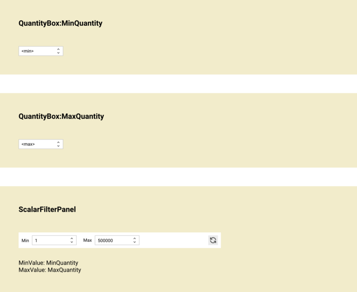
In the example, ScalarFilterPanel has two DecimalBox children aliased as MinValue and MaxValue. These are swapped with the children MinQuantity and MaxQuantity using property assignment, themselves aliased QuantityBox children. Because QuantityBox is simply a customized DecimalBox, this swap is non-breaking.
While properties are always snake_case, named components are PascalCase.
Example: Box
Data:
  body: The component displayed in the box.
The above excerpt from the model for Box defines body as a property that is a component. This makes it clear that any component can be displayed inside Box. This is the preferred way for defining a slot in a component. When the component needs to be type-restricted (e.g. only a DecimalBox), this can be made explicit in the model.
Animations
Animations are just values in Spire, so they can be declared directly as property values.
To have an animated color sequence on a Box, its background_color property would be declared using a function that switches between colors.
border_color: chain(timeout(#B71C1C, 550ms), revert)
In the above snippet, the border_color property is set to change to a red color for 550ms and then revert to its previous color.
Filepaths
Filepaths are valid values for certain properties, such as SVGs for icons. The root folder is the folder for the component. By convention, assets belong in an /assets folder. To specify an icon:
icon: /assets/custom-icon.svg
The parent folder for all specs can also be referenced as the root folder:
icon: /ui_kit/assets/window_icons/dashboard.svg
Variables and Strings
Whether the property declaration is a variable or should be interpreted as a string value is inferred from context. Variables are normally assumed. Double quotes can be used to indicate that a string is being specified (useful when there is whitespace). Variables can be output inside a string using concatenation or angle brackets for string interpolation.
current: “The price is <price>”
In the above example, a variable named price is interpolated into a string. The output would look like: The price is 9.99. The following achieves the same result:
current: “The price is ” + price
Expressions
Any expression that evaluates to a value can be set as a property. Revisiting the animation example:
border_color: chain(timeout(#B71C1C, 550ms), revert)
chain(X, Y)is an animation that applies animated styleXuntilXends, and then applies styleYtimeout(X, Y)applies the styleXfor a period ofYrevertis a style that applies whatever style would have otherwise been applied
The result is a sequence of values for border_color that changes over time. Basic math operators and self-explanatory functions can also be used. This can be useful for formatting, as in the following FormattedDecimalLabel example:
current: “<DecimalLabel.current * 100>%”
The variable DecimalLabel.current is multiplied by 100 and then formatted with a % sign.
Generally it is preferable to avoid using complex expressions in property declarations as it makes components.xd less readable. Expressions should be done in consultation with a developer. If considering conditional expressions, try to restructure it into a separate scenario with a comparatively simple expression.
Bindings
When a property declaration expression contains dependencies (other variables) and those dependencies update, the property is automatically assumed to update. In the following example from FormattedDecimalLabel
current: “<DecimalLabel.current * 100>%”
Whenever DecimalLabel.current changes, current here will also change. It is not simply an initialization that is set once. Presently, there is no formal way of specifying that a declaration should be an initialization only and non-binding as a use-case has not come up.
Ordering
List children top to bottom from innermost to outermost. If there are children at the same level in the hierarchy (siblings), they should be ordered from simplest to most complex (a more complex component is one with more children, e.g. ListItem is simpler than ScrollableListBox). If siblings have the same complexity, they should appear in the order they occur when scanning the component from left to right and top to bottom. Each child occupies a full row, with its scenarios separated into columns.
Example: AccountListItem
In the AccountListItem example, there are three children responsible for displaying three pieces of data: - Identicon: an Icon that displays the identicon for the account - ID: a Label that displays the account user id - Name: a Label that displays the name associated with the account
With the exception of Identicon, the children are siblings, so the ordering of them follows their layout. Note that there is a Box named IdenticonBox that contains the Identicon and it comes below the Identicon.
Example: OpenFilterPanel
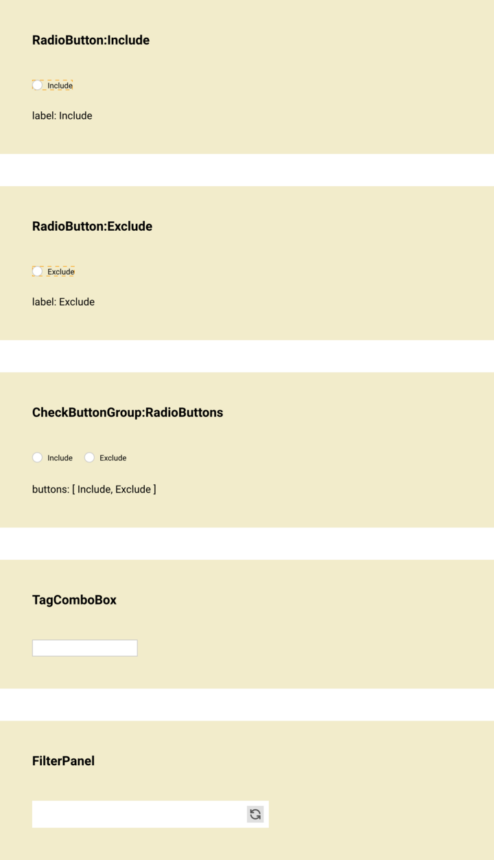
The outermost component is FilterPanel. It contains a reset button and a slot for placing the specific filtering controls. Since the components.xd for FilterPanel already handles the reset button, it doesn’t need to be handled here. The direct children of the slot are RadioButtons, a group of two radio buttons, and TagComboBox. The radio buttons Include and Exclude are the children of RadioButtons.
In the breakdown, Include and Exclude come first, followed by RadioButtons and TagComboBox, with FilterPanel last.
Usage
It is recommended to use components.xd as fully as possible before considering putting information into layout.xd or user_flow.drawio. Conditional styling via scenarios is a powerful and readable way to declaratively style a component.


