Difference between revisions of "UI Kit"
| (13 intermediate revisions by the same user not shown) | |||
| Line 21: | Line 21: | ||
==User Flow== | ==User Flow== | ||
| − | With the model defined, the user flow describes how the model is transformed based on external events. The flow | + | With the model defined, the user flow describes how the model is transformed based on external events. The user flow is broken down into a set of steps represented by colored shapes and are connected to one another by arrows. In order to follow a step, a list of criteria must be met depending on type of step represented. When a step is followed a function is performed at which point the step is said to be complete and then every arrow pointing away from the step must be evaluated to determine the next step to go to. If a step has no arrows pointing out of it, then that step is said to be a terminal step at which point no further changes to the UI are possible. |
| − | ====The start state==== | + | In cases where a UI component is provided by the platform and already has an existing implementation, it may not be necessary to provide a user flow and instead the UI component can either reuse the existing user flow or defer the user flow to the platform. For example most platforms including HTML, macOS, Windows etc... already provide a text input field as well as a button, in those cases it is preferable to defer the user flow to the respective platform instead of redefining one. Only in cases where custom functionality or custom components are being created is a user flow required. |
| + | |||
| + | Flow charts are documented using software available at https://diagrams.net | ||
| + | |||
| + | ===Start=== | ||
| + | <br> | ||
| + | [[File:ui_kit_start.png|Start step]] | ||
| + | <br> | ||
| + | <br> | ||
| + | Every UI component begins at the start step, it appears as a dark green circle and is typically either the left-most step of the user flow or the top-most step. It can also be formally distinguished by the fact that it's the only step that may not have any arrows pointing into it, arrows may only point away from it. The start step does not perform any function and is only used as a visual indicator to quickly determine where the flow chart begins. | ||
| + | |||
| + | If the UI performs any kind of initialization then the start step should have a single arrow pointing towards a step to handles such initialization. Refer to the login window for an example. | ||
| + | |||
| + | ===Actions=== | ||
| + | <br> | ||
| + | [[File:ui_kit_action.png|Action step]] | ||
| + | <br> | ||
| + | <br> | ||
| + | Actions are steps that are taken unconditionally and perform a side-effect such as changing the state of the component or updating the model. Actions can be chained together by arrows to form a sequence of side-effects or multiple actions can be consolidated into a single step that performs the sequence. The choice of chaining versus consolidating is stylistic, if a step gets to be too large then it is preferable to break it into multiple steps that are chained together. If there are multiple small actions chained together then it is preferable to consolidate. | ||
| + | |||
| + | Every side-effect specified by an action should be a single sentence that begins with a verb. For example if updating data XYZ in the model to the value 123, then the side-effect should be "Set XYZ to 123." The function of an action step is execute each side-effect in order. | ||
| + | |||
| + | A no-op can be used to indicate that no side-effect is to be performed. This can come in handy to describe an action state that does nothing but wait. | ||
| + | |||
| + | ===Events=== | ||
| + | <br> | ||
| + | [[File:ui_kit_event.png|Event step]] | ||
| + | <br> | ||
| + | <br> | ||
| + | An event is step external to the UI that the UI has a chance to respond to. Events can be triggered by user input such as a keyboard press, mouse movement, or other input device as well as by signals produced by other UI components, such as a button indicating that it has been clicked or an input UI indicating an update to the model. An event step is followed if the event takes place after the completion of the current step's function. While multiple events may happen very close together in time, it is never possible for multiple events to occur simultaneously. | ||
| + | |||
| + | ===Conditions=== | ||
| + | <br> | ||
| + | [[File:ui_kit_condition.png|Condition step]] | ||
| + | <br> | ||
| + | <br> | ||
| + | A condition is a step that is followed if at the completion of the current step's function some condition is satisfied. If a step leads to multiple conditions then it must either be the case that only one such condition can possibly be satisfied or each arrow pointing out of the step and into a condition must be labelled numerically starting from <code>0</code> in which case each condition is tested in ascending order and the first condition that is satisfied is followed. For example consider the following user flow: | ||
| + | <br> | ||
| + | <br> | ||
| + | [[File:ui_kit_priority.png|Prioritizing conditions]] | ||
| + | <br> | ||
| + | <br> | ||
| + | |||
| + | If the current time is 6:30 PM then all three conditions are technically satisfied and so there is an ambiguity about which condition to follow. The numeric labels on the arrows are thus used to prioritize the conditions so that the conditional step <code>current time >= 6:00 PM</code> is tested first and if satisfied then it's followed without considering the remaining conditions. | ||
| + | |||
| + | ===Tests=== | ||
| + | <br> | ||
| + | [[File:ui_kit_test.png|Test step]] | ||
| + | <br> | ||
| + | <br> | ||
| + | |||
| + | Similar to the condition step, the test step can also be used to conditionally follow an arrow. The test step itself is followed unconditionally and the function of the step is to perform a test. Once the function is completed a set of labelled arrows pointing away from the step are checked and the arrow whose label satisfies the test is followed. | ||
| + | |||
| + | Both condition steps and test steps are technically interchangeable, the choice of one or the other is stylistic. One should prefer the test step in situations where a clear question can be asked and whose answer is a single value in which case the question is written in the body of the test step and each of the possible values or value ranges is a labelled arrow. | ||
| + | |||
| + | ===Signals=== | ||
| + | <br> | ||
| + | [[File:ui_kit_signal.png|Signal step]] | ||
| + | <br> | ||
| + | <br> | ||
| + | |||
| + | The function of a signal is to inform other UI components about a change in state so that those other components can respond to such changes in the form of events. That is, a signal produced by one UI component is treated as an event by another UI component. For example, a button UI contains a <code>clicked</code> signal step indicating that the user clicked on it and in turn a form UI contains a corresponding <code>button clicked</code> event step where said form may respond by updating its data model. | ||
| + | |||
| + | Similar to an action step, signal steps are followed unconditionally. | ||
| + | |||
| + | ===Ambiguities=== | ||
| + | |||
| + | An ambiguity is a step that contains multiple arrows that are simultaneously satisfied. A flow chart that contains an ambiguity is ill-formed and must be resolved. For example if a step <code>Q</code> has an arrow leading into an unconditional step (such as leading into an action or signal step), it must be the only arrow leading out of <code>Q</code>, any other arrow would necessarily introduce an ambiguity. If a step has multiple arrows leading into conditional steps where more than one condition is satisfied then that too is an ambiguity. Resolving such ambiguity is done by giving each arrow a priority. | ||
| + | |||
| + | ===Example: Button=== | ||
| + | |||
| + | The following is an example of a simplified button user flow. The button only responds to user events when it's enabled. Furthermore whether the user presses the enter key, or the space bar, or uses the mouse to click, the button responds to all such events with the same <code>clicked</code> signal. This allows more complex UIs to respond uniformly to a button without having to explicitly specify the manner in which a user interacted with it. | ||
| + | |||
| + | Finally note that no consideration is made for a change in the label or a change in the hover state since both of those changes are strictly visual, they affect the appearance of the button but do not in anyway affect the behavior. | ||
| + | |||
| + | <br> | ||
| + | [[File:user_flow_button.png|Button example]] | ||
| + | <br> | ||
| + | <br> | ||
| + | |||
| + | ===Example: Login form=== | ||
| + | |||
| + | A login form's model consists of data representing a username and password that is input by the user, a state to store whether the user is in the process of logging in, and signals indicating whether the user has submitted their credentials or wishes to cancel a currently pending sign-in attempt. Its <code>model.txt</code> is hence structured as follows: | ||
| + | <pre> | ||
| + | Data: | ||
| + | username: The username input by the user. | ||
| + | password: The user's password being input. | ||
| + | |||
| + | State: | ||
| + | status: The sign-in status of the UI, can be one of the following values: | ||
| + | NONE - Default state. | ||
| + | SIGNING-IN - The UI is in the process of signing in. | ||
| + | REJECTED - The sign in was rejected, invalid username or password. | ||
| + | UNAVAILABLE - The server is not available. | ||
| + | SIGNED-IN - The sign in process succeeded. | ||
| + | |||
| + | Signals: | ||
| + | submit: Indicates the user has submitted their login credentials. | ||
| + | cancel: The user wishes to cancel the sign-in process. | ||
| + | </pre> | ||
| + | |||
| + | The user flow for the login form is below: | ||
| + | |||
| + | [[File:user_flow_login.png|Login example]] | ||
Latest revision as of 12:43, 14 July 2020
User interfaces are specified by a set of documents describing a data model, user flow, layout, and styling. This article will go over each of these documents along with how they combine to describe the complete behavior from a small component such a button to larger components such as a login window. The example that will be used in each document is a user interface for a button component.
Contents
Model
Fundamentally, a UI is a visual representation of a set of data in a given state. The UI takes in that data upon initialization and transforms it based on external actions either provided by the user directly or some other external agent. In order for multiple UI components to work together, individual components signal when certain changes are made to that data or to the state of the component, which allows other UI components to respond and signal changes of their own. The complete description of the data a UI component operates on, the state of the component, as well as the signals it produces form the model and is typically documented in model.txt. For a simple component such as a button we'd expect to see a label displayed by the button, whether the button is responding to user inputs, whether the mouse is interacting with the button, and finally a signal indicating when the user clicks on it. This would be documented as follows:
Data:
  label: The text displayed in the button.
  enabled: Whether the button is responding to user actions.

State:
  hovered: Whether the mouse position is within the button's visible region.

Signals:
  clicked: Indicates the button was clicked by the user.
As a general matter, fields that go under Data are inputs that are provided externally to the UI component, whereas fields that go under State are internal to the component itself. Typically a button does not know what label it should display and does not manage changes to the label, some external component shall make use of a button and provide it with a label to display. Conversely the button can independently manage whether the mouse is hovered over it on its own by keeping track of the mouse position, it needs no external agent to inform it of this state.
User Flow
With the model defined, the user flow describes how the model is transformed based on external events. The user flow is broken down into a set of steps represented by colored shapes and are connected to one another by arrows. In order to follow a step, a list of criteria must be met depending on type of step represented. When a step is followed a function is performed at which point the step is said to be complete and then every arrow pointing away from the step must be evaluated to determine the next step to go to. If a step has no arrows pointing out of it, then that step is said to be a terminal step at which point no further changes to the UI are possible.
In cases where a UI component is provided by the platform and already has an existing implementation, it may not be necessary to provide a user flow and instead the UI component can either reuse the existing user flow or defer the user flow to the platform. For example most platforms including HTML, macOS, Windows etc... already provide a text input field as well as a button, in those cases it is preferable to defer the user flow to the respective platform instead of redefining one. Only in cases where custom functionality or custom components are being created is a user flow required.
Flow charts are documented using software available at https://diagrams.net
Start

Every UI component begins at the start step, it appears as a dark green circle and is typically either the left-most step of the user flow or the top-most step. It can also be formally distinguished by the fact that it's the only step that may not have any arrows pointing into it, arrows may only point away from it. The start step does not perform any function and is only used as a visual indicator to quickly determine where the flow chart begins.
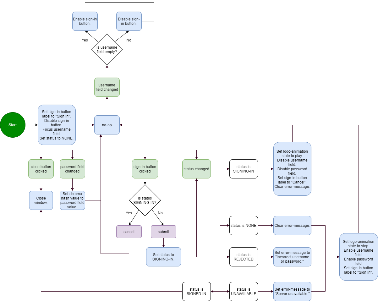
If the UI performs any kind of initialization then the start step should have a single arrow pointing towards a step to handles such initialization. Refer to the login window for an example.
Actions

Actions are steps that are taken unconditionally and perform a side-effect such as changing the state of the component or updating the model. Actions can be chained together by arrows to form a sequence of side-effects or multiple actions can be consolidated into a single step that performs the sequence. The choice of chaining versus consolidating is stylistic, if a step gets to be too large then it is preferable to break it into multiple steps that are chained together. If there are multiple small actions chained together then it is preferable to consolidate.
Every side-effect specified by an action should be a single sentence that begins with a verb. For example if updating data XYZ in the model to the value 123, then the side-effect should be "Set XYZ to 123." The function of an action step is execute each side-effect in order.
A no-op can be used to indicate that no side-effect is to be performed. This can come in handy to describe an action state that does nothing but wait.
Events

An event is step external to the UI that the UI has a chance to respond to. Events can be triggered by user input such as a keyboard press, mouse movement, or other input device as well as by signals produced by other UI components, such as a button indicating that it has been clicked or an input UI indicating an update to the model. An event step is followed if the event takes place after the completion of the current step's function. While multiple events may happen very close together in time, it is never possible for multiple events to occur simultaneously.
Conditions

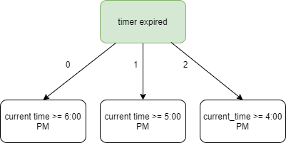
A condition is a step that is followed if at the completion of the current step's function some condition is satisfied. If a step leads to multiple conditions then it must either be the case that only one such condition can possibly be satisfied or each arrow pointing out of the step and into a condition must be labelled numerically starting from 0 in which case each condition is tested in ascending order and the first condition that is satisfied is followed. For example consider the following user flow:

If the current time is 6:30 PM then all three conditions are technically satisfied and so there is an ambiguity about which condition to follow. The numeric labels on the arrows are thus used to prioritize the conditions so that the conditional step current time >= 6:00 PM is tested first and if satisfied then it's followed without considering the remaining conditions.
Tests
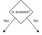
Similar to the condition step, the test step can also be used to conditionally follow an arrow. The test step itself is followed unconditionally and the function of the step is to perform a test. Once the function is completed a set of labelled arrows pointing away from the step are checked and the arrow whose label satisfies the test is followed.
Both condition steps and test steps are technically interchangeable, the choice of one or the other is stylistic. One should prefer the test step in situations where a clear question can be asked and whose answer is a single value in which case the question is written in the body of the test step and each of the possible values or value ranges is a labelled arrow.
Signals
The function of a signal is to inform other UI components about a change in state so that those other components can respond to such changes in the form of events. That is, a signal produced by one UI component is treated as an event by another UI component. For example, a button UI contains a clicked signal step indicating that the user clicked on it and in turn a form UI contains a corresponding button clicked event step where said form may respond by updating its data model.
Similar to an action step, signal steps are followed unconditionally.
Ambiguities
An ambiguity is a step that contains multiple arrows that are simultaneously satisfied. A flow chart that contains an ambiguity is ill-formed and must be resolved. For example if a step Q has an arrow leading into an unconditional step (such as leading into an action or signal step), it must be the only arrow leading out of Q, any other arrow would necessarily introduce an ambiguity. If a step has multiple arrows leading into conditional steps where more than one condition is satisfied then that too is an ambiguity. Resolving such ambiguity is done by giving each arrow a priority.
Example: Button
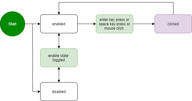
The following is an example of a simplified button user flow. The button only responds to user events when it's enabled. Furthermore whether the user presses the enter key, or the space bar, or uses the mouse to click, the button responds to all such events with the same clicked signal. This allows more complex UIs to respond uniformly to a button without having to explicitly specify the manner in which a user interacted with it.
Finally note that no consideration is made for a change in the label or a change in the hover state since both of those changes are strictly visual, they affect the appearance of the button but do not in anyway affect the behavior.
Example: Login form
A login form's model consists of data representing a username and password that is input by the user, a state to store whether the user is in the process of logging in, and signals indicating whether the user has submitted their credentials or wishes to cancel a currently pending sign-in attempt. Its model.txt is hence structured as follows:
Data:
  username: The username input by the user.
  password: The user's password being input.

State:
  status: The sign-in status of the UI, can be one of the following values:
            NONE - Default state.
            SIGNING-IN - The UI is in the process of signing in.
            REJECTED - The sign in was rejected, invalid username or password.
            UNAVAILABLE - The server is not available.
            SIGNED-IN - The sign in process succeeded.

Signals:
  submit: Indicates the user has submitted their login credentials.
  cancel: The user wishes to cancel the sign-in process.
The user flow for the login form is below:


