File list
This special page shows all uploaded files.
| Date | Name | Thumbnail | Size | User | Description | Versions |
|---|---|---|---|---|---|---|
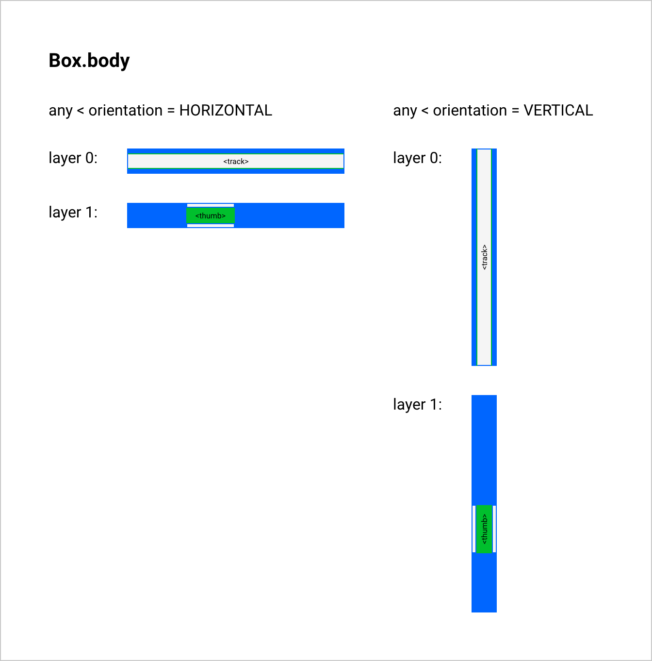
| 10:38, 19 March 2024 | Slider layout Box.body.png (file) |  |
70 KB | Jon | Layout for the body of Box sub-component of Slider. | 1 |
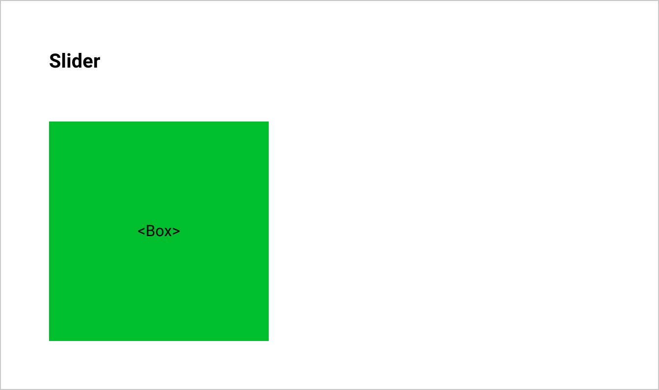
| 10:39, 19 March 2024 | Slider layout Slider.png (file) |  |
30 KB | Jon | Layout section for Slider. | 1 |
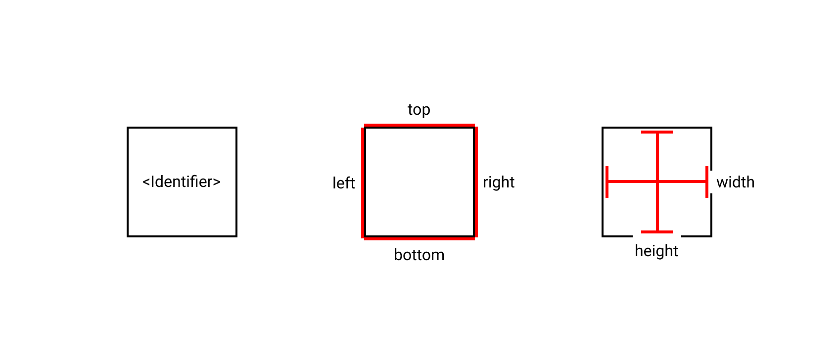
| 10:40, 19 March 2024 | Element Basics.png (file) |  |
14 KB | Jon | Diagram of basic element properties within a layout. | 1 |
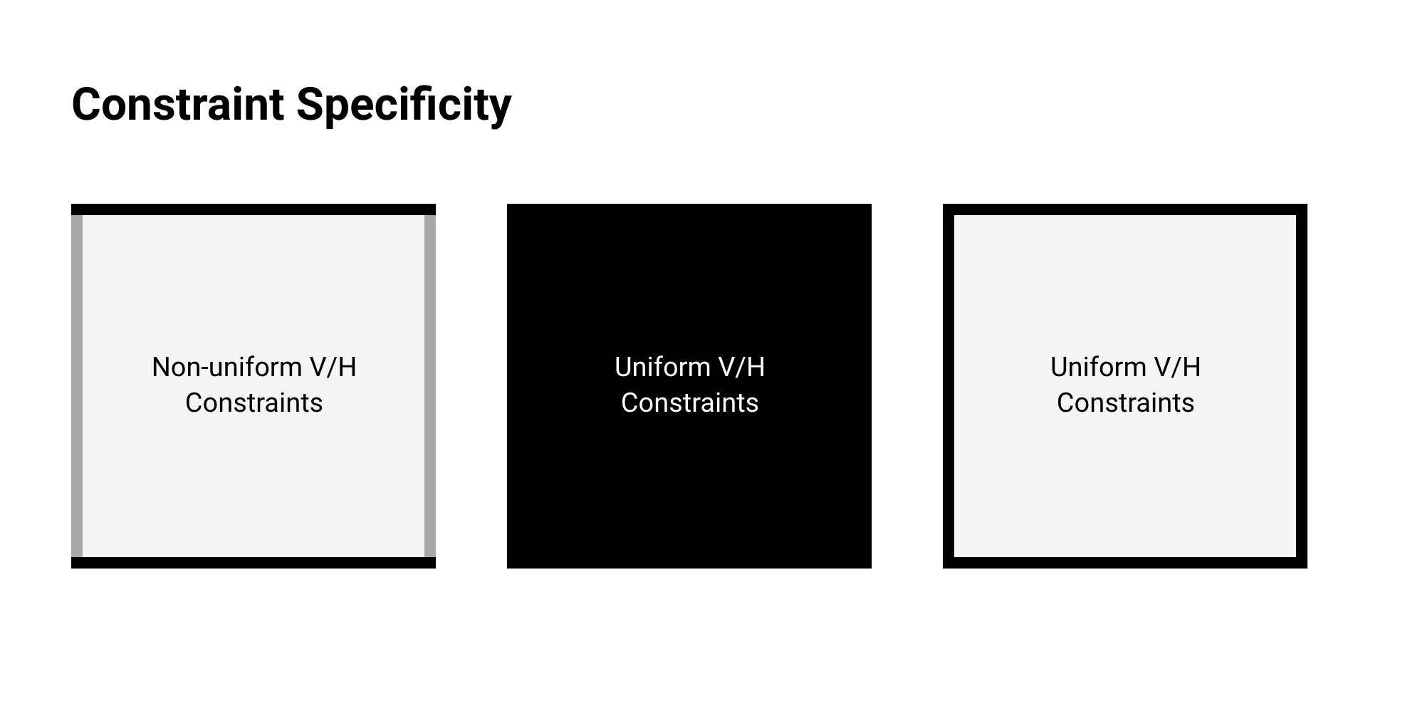
| 10:41, 19 March 2024 | LayoutSpecificity.png (file) |  |
88 KB | Jon | Overview of constraint specificity for elements within a layout. | 1 |
| 10:42, 19 March 2024 | LayoutColorSemantics.png (file) |  |
123 KB | Jon | Overview of color encoding of elements and their semantics within a layout. | 1 |
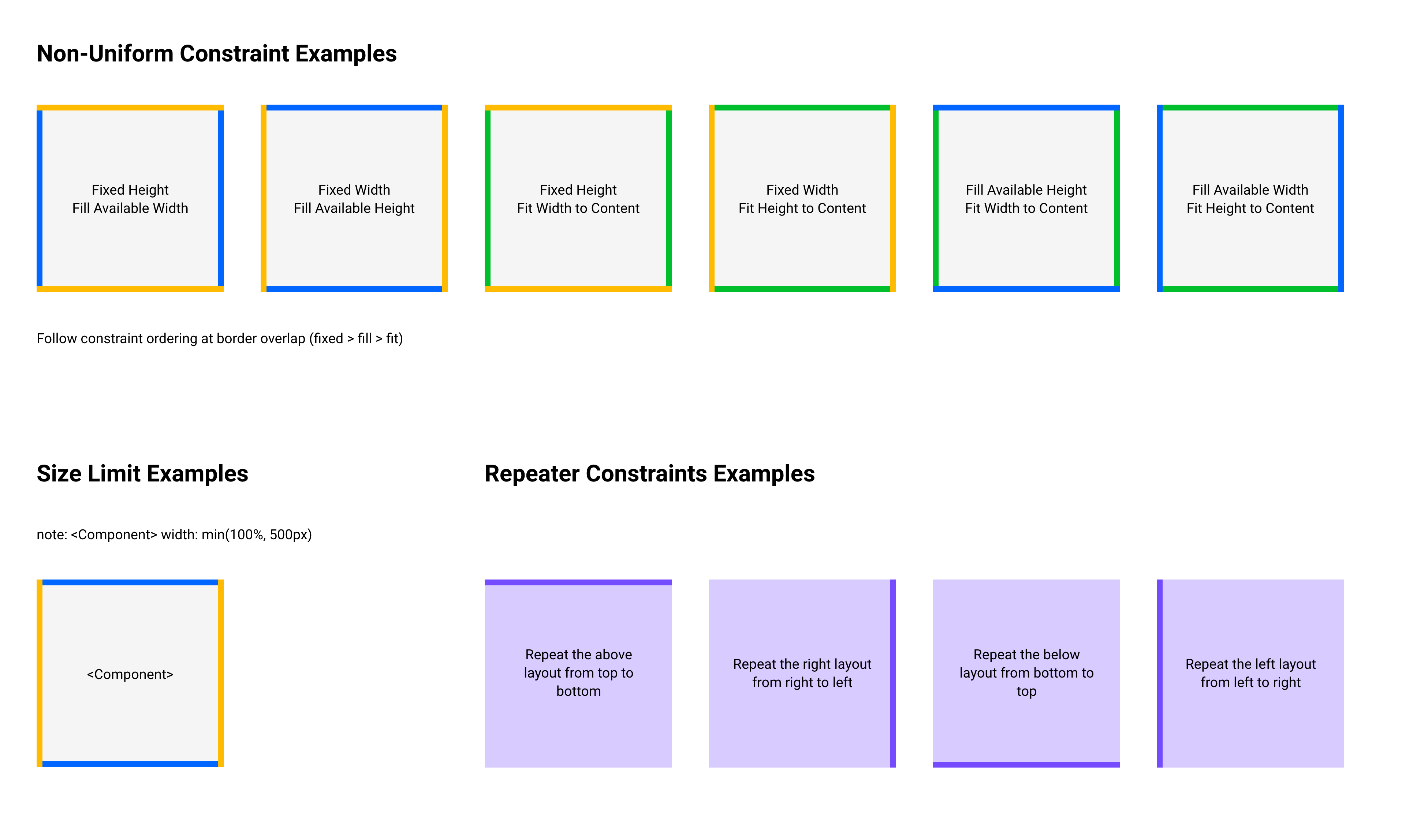
| 10:43, 19 March 2024 | LayoutExamples.png (file) |  |
392 KB | Jon | Examples of layout elements with color-encoded constraints applied. | 1 |
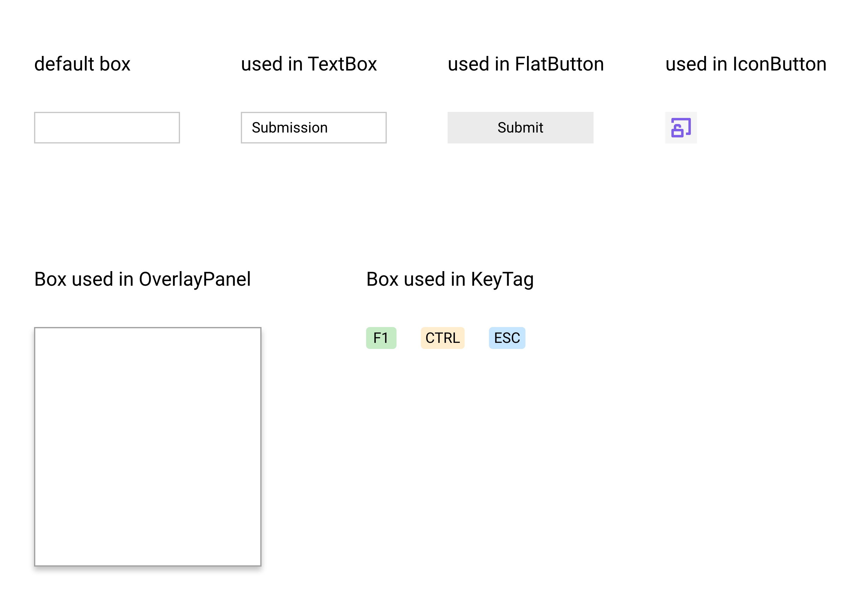
| 10:44, 19 March 2024 | Box preview.png (file) |  |
184 KB | Jon | Preview of Box component, showing its usage in various components including TextBox and LabelButton. | 1 |
| 10:45, 19 March 2024 | Box layout.png (file) |  |
85 KB | Jon | Layout for Box, detailing the arrangement of border, padding, and body elements. | 1 |
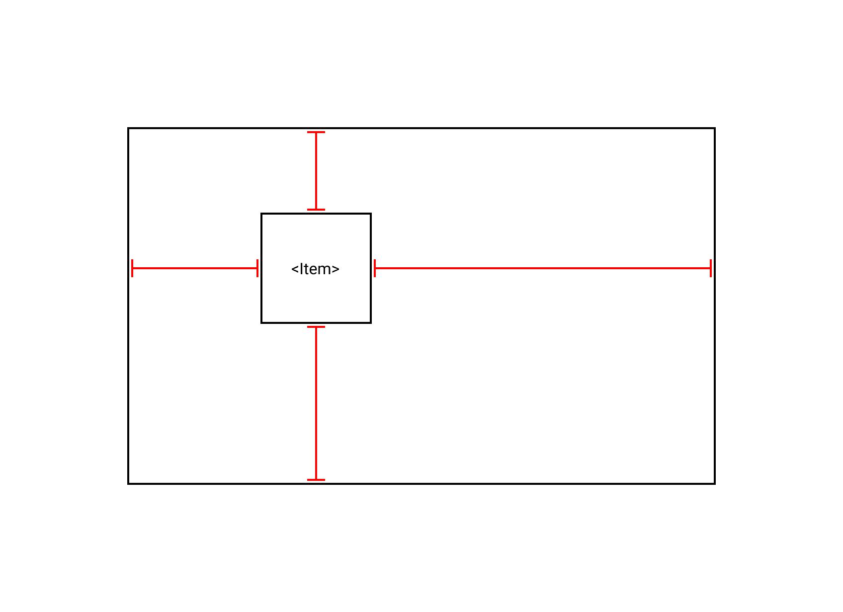
| 10:47, 19 March 2024 | Positioning 1.png (file) |  |
12 KB | Jon | Diagram of an element named Item arbitrarily positioned within its parent container. | 1 |
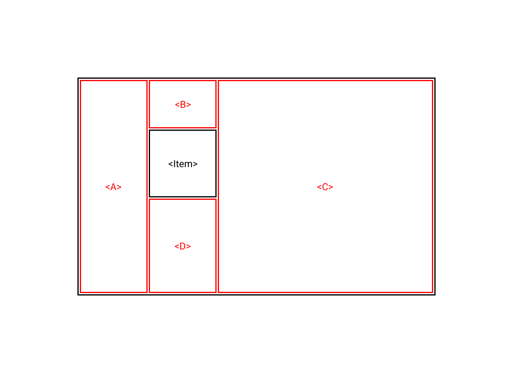
| 10:48, 19 March 2024 | Positioning 2.png (file) |  |
15 KB | Jon | Diagram of an element named Item positioned within its parent container. Surrounding elements A, B, C, and D fill the space between Item and the edges of the container. | 1 |
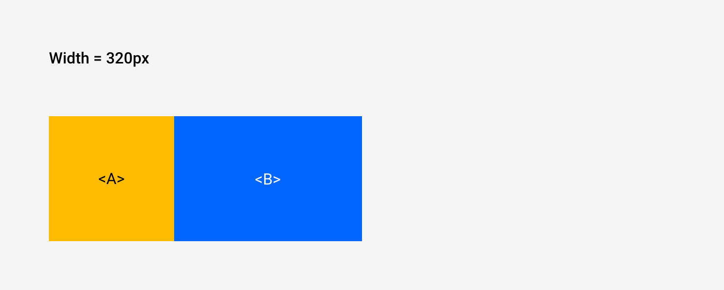
| 10:50, 19 March 2024 | Example1 1.png (file) |  |
28 KB | Jon | Example layout for two elements A and B with an overall width of 320 pixels. | 1 |
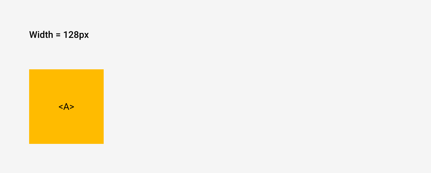
| 10:51, 19 March 2024 | Example1 2.png (file) |  |
25 KB | Jon | Example layout showing a single element A with an overall width of 128 pixels. | 1 |
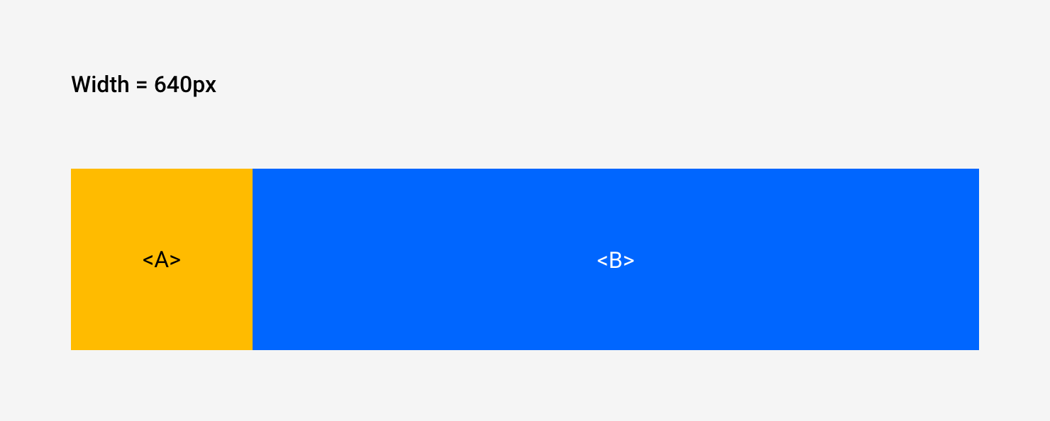
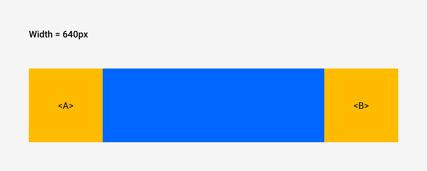
| 10:51, 19 March 2024 | Example1 3.png (file) |  |
28 KB | Jon | Example layout of two elements A and B with an overall width of 640 pixels. | 1 |
| 10:52, 19 March 2024 | Example2 1.png (file) |  |
29 KB | Jon | Example layout of three elements: A, and anonymous spacer, and B, with an overall width of 320 pixels. | 1 |
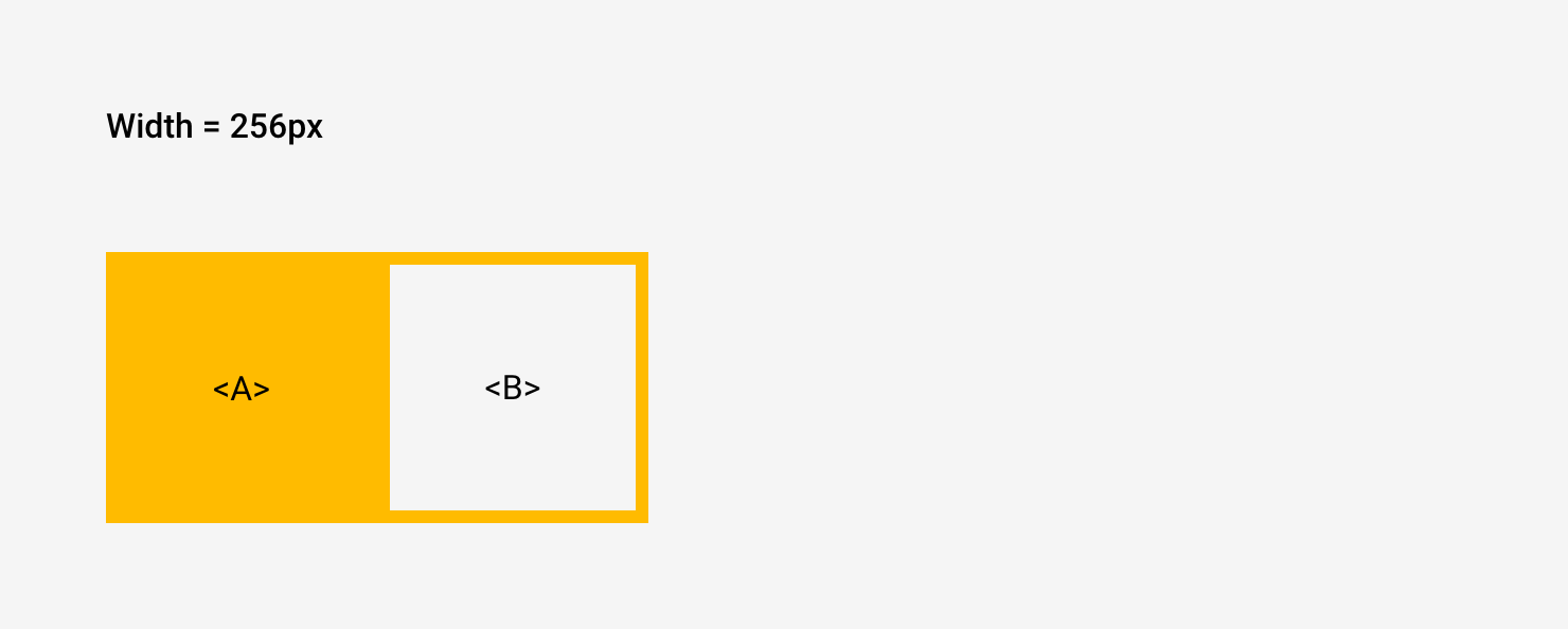
| 10:53, 19 March 2024 | Example2 2.png (file) |  |
29 KB | Jon | Example layout of two elements A and B with an overall width of 256 pixels. | 1 |
| 10:54, 19 March 2024 | Example2 3.png (file) |  |
30 KB | Jon | Example layout of three elements: A, an anonymous spacer, and B, with an overall width of 640 pixels. | 1 |
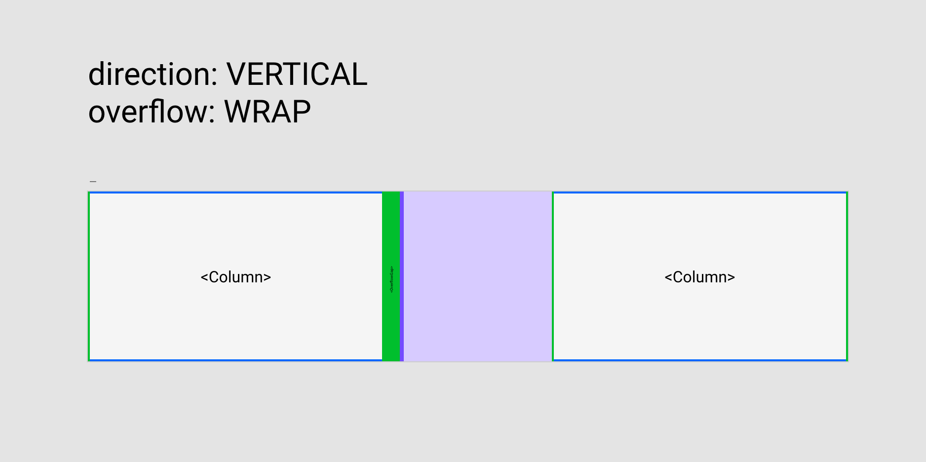
| 10:55, 19 March 2024 | ListView layout.png (file) |  |
76 KB | Jon | Layout for the body of the Box sub-component of ListView when the direction is VERTICAL and the overflow is WRAP. | 1 |
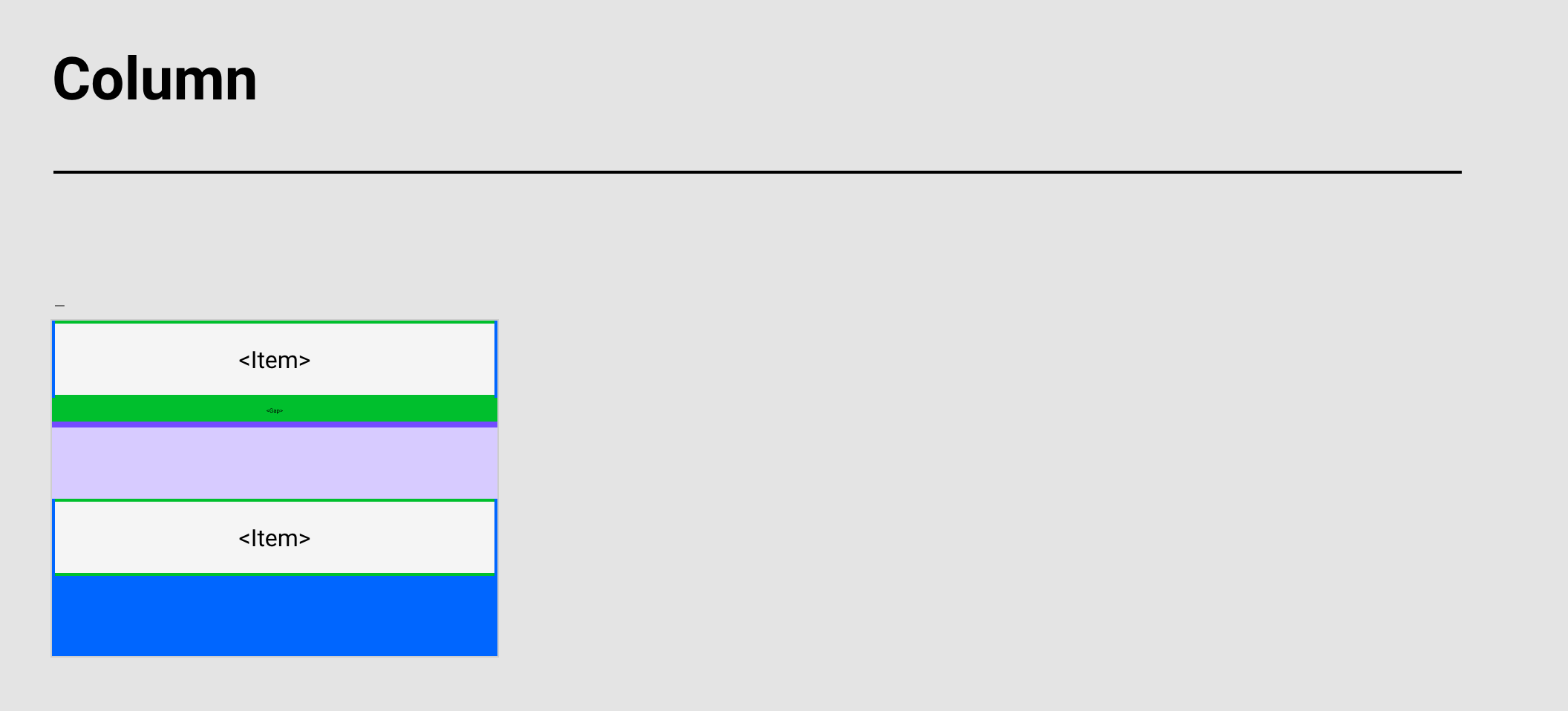
| 10:56, 19 March 2024 | ListView layout-2.png (file) |  |
57 KB | Jon | Layout for the Column element within the ListView component. | 1 |
| 10:57, 19 March 2024 | TitleBar preview-2.png (file) |  |
75 KB | Jon | Preview for the TitleBar component. | 1 |
| 10:58, 19 March 2024 | TitleBar layout.png (file) |  |
160 KB | Jon | Layout for the TitleBar component. | 1 |
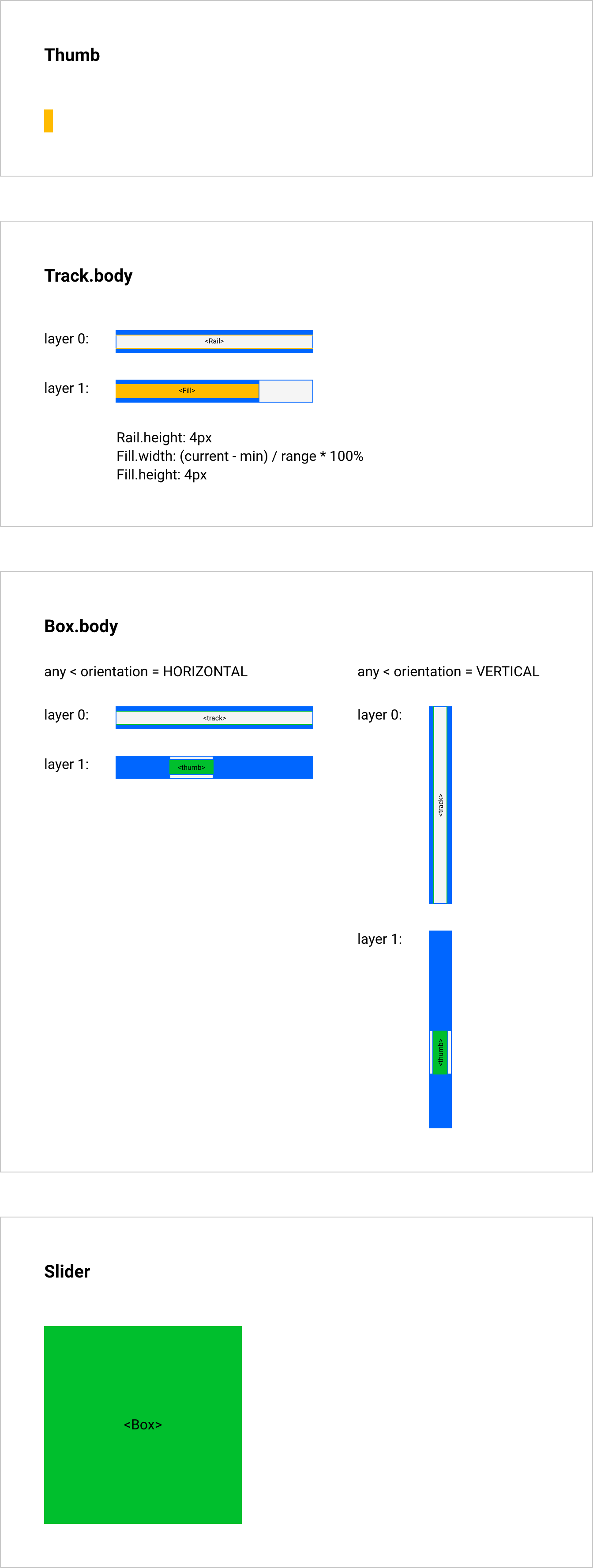
| 11:01, 19 March 2024 | Slider Layouts.png (file) |  |
170 KB | Jon | Layout for the Slider component. | 1 |
| 11:24, 19 March 2024 | SplitView layout anatomy.png (file) |  |
406 KB | Jon | 2 | |
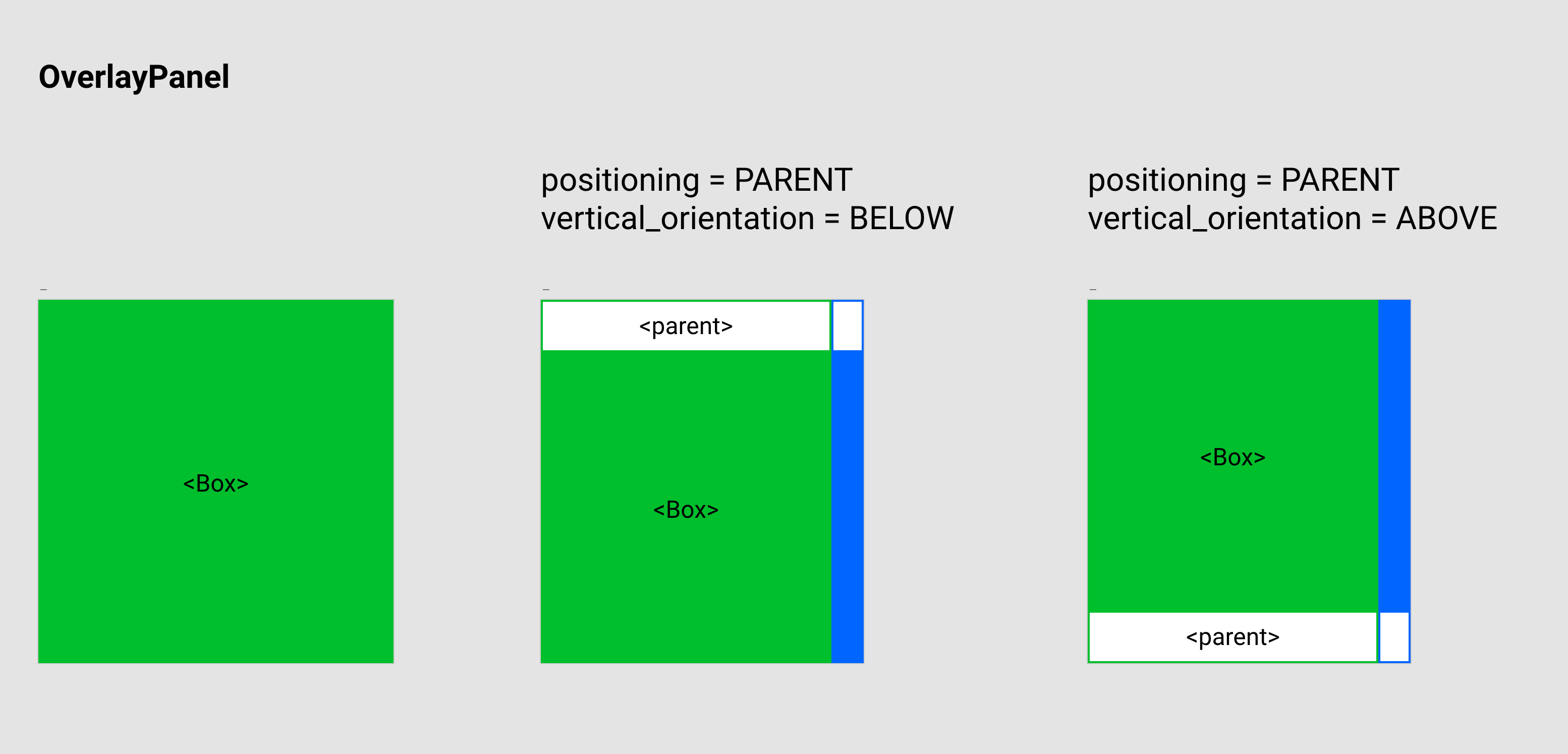
| 11:25, 19 March 2024 | OverlayPanel layout.png (file) |  |
183 KB | Jon | Layout for the OverlayPanel component. | 1 |
| 11:25, 19 March 2024 | DecimalBox layout.png (file) |  |
65 KB | Jon | Layout for the DecimalBox component. | 1 |
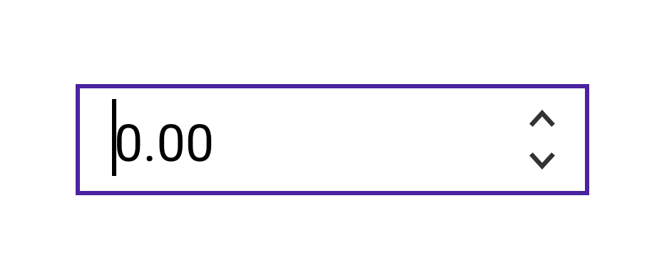
| 11:26, 19 March 2024 | DecimalBox preview.png (file) |  |
20 KB | Jon | Preview for the DecimalBox component. | 1 |
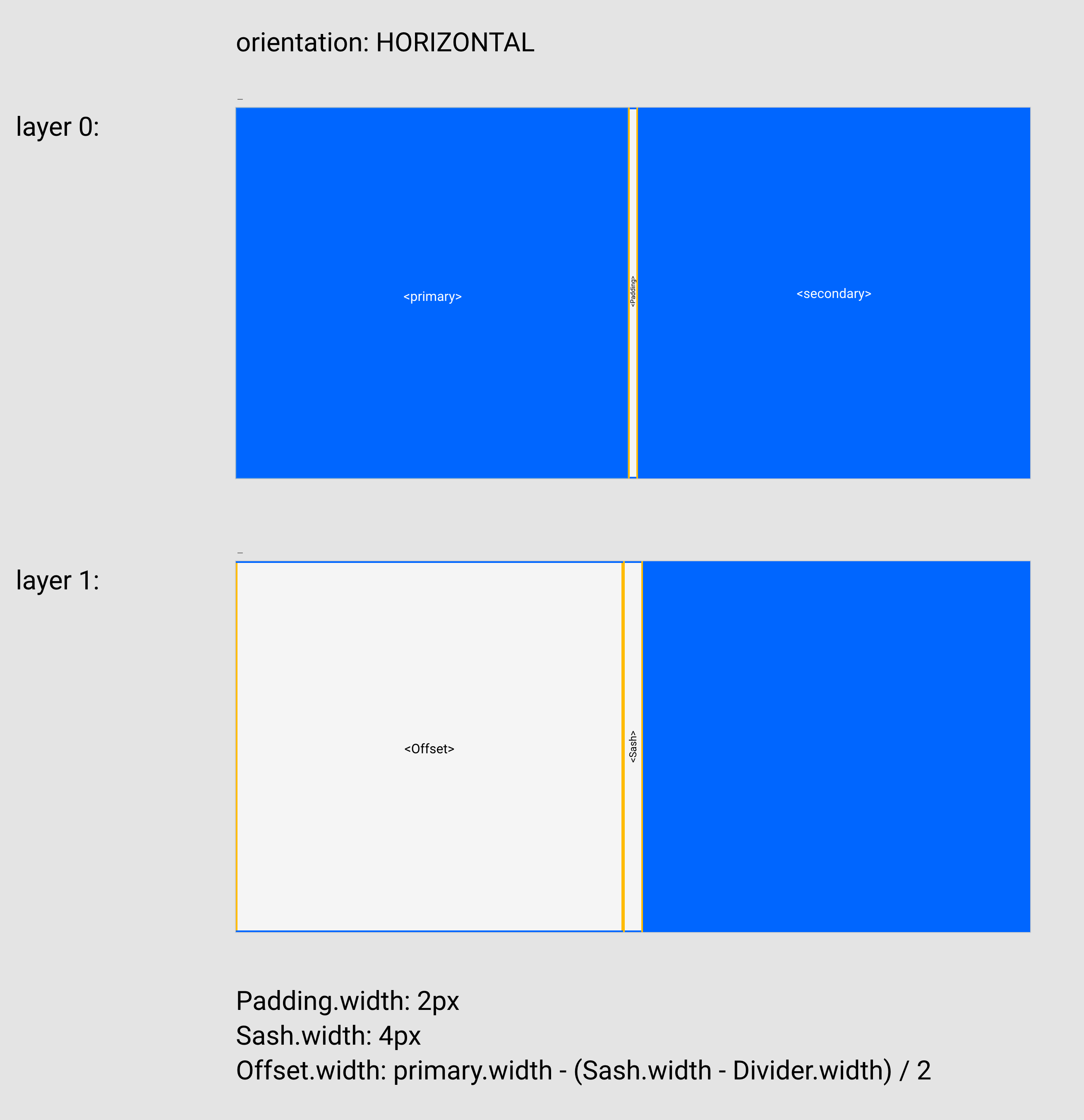
| 11:28, 19 March 2024 | SplitView layout.png (file) |  |
260 KB | Jon | Layout for SplitView component when orientation is HORIZONTAL. | 1 |
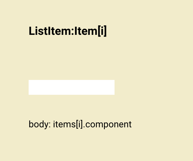
| 11:28, 19 March 2024 | ListView components.png (file) |  |
23 KB | Jon | Definition card for Item sub-component for ListView. | 1 |
| 11:29, 19 March 2024 | DropDownList layout.png (file) |  |
97 KB | Jon | Layout for DropDownList component. | 1 |
| 11:30, 19 March 2024 | TabView components.png (file) |  |
278 KB | Jon | Definition cards for the children of TabView in components.xd. | 1 |
| 11:30, 19 March 2024 | TabView layout.png (file) |  |
132 KB | Jon | Layout for TabView component. | 1 |
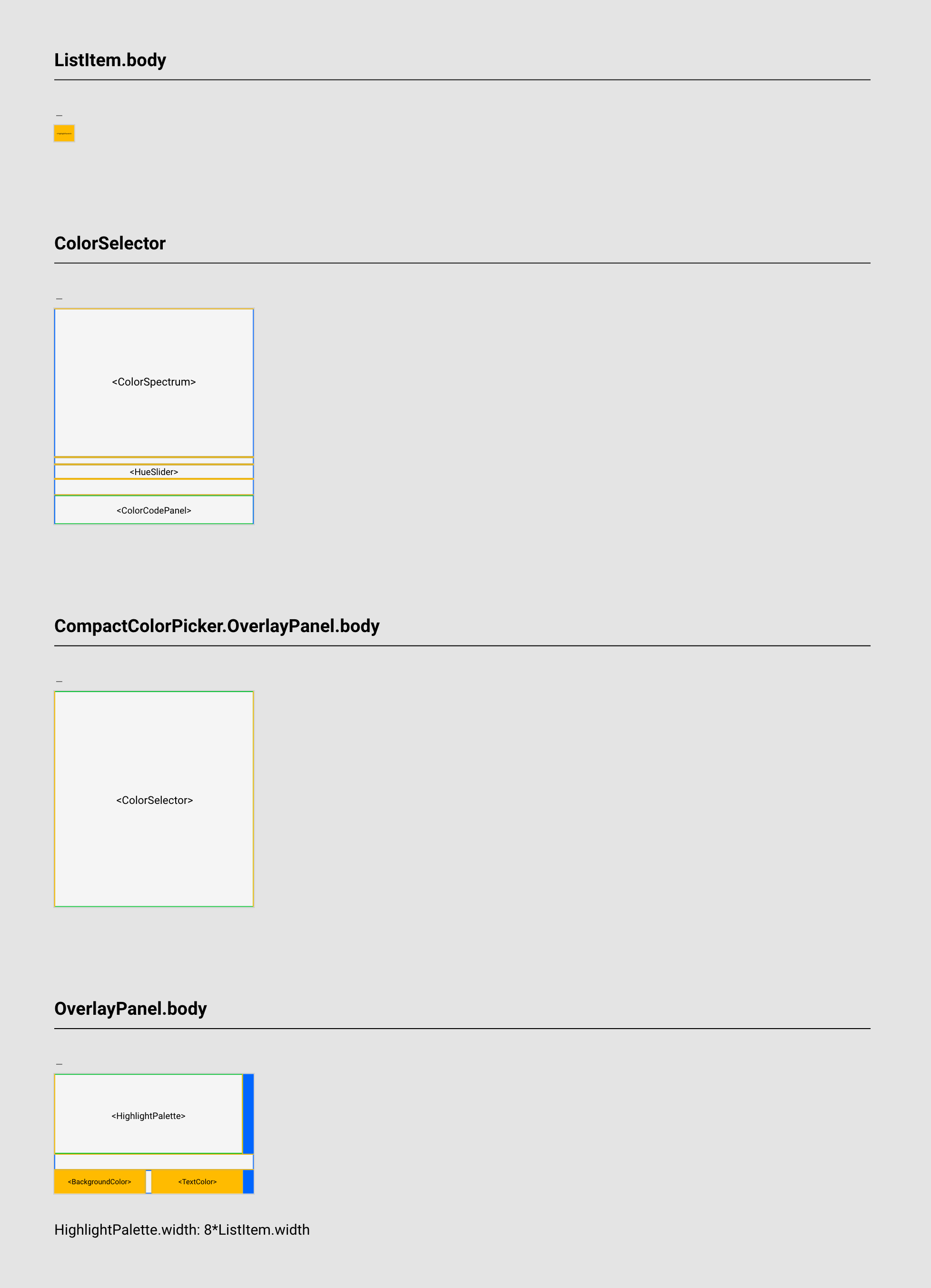
| 11:31, 19 March 2024 | HighlightPicker layout.png (file) |  |
181 KB | Jon | Layout for HighlightPicker component. | 1 |
| 11:31, 19 March 2024 | TechnicalsPanel preview.png (file) |  |
437 KB | Jon | Preview of the Technicals Panel component. | 1 |
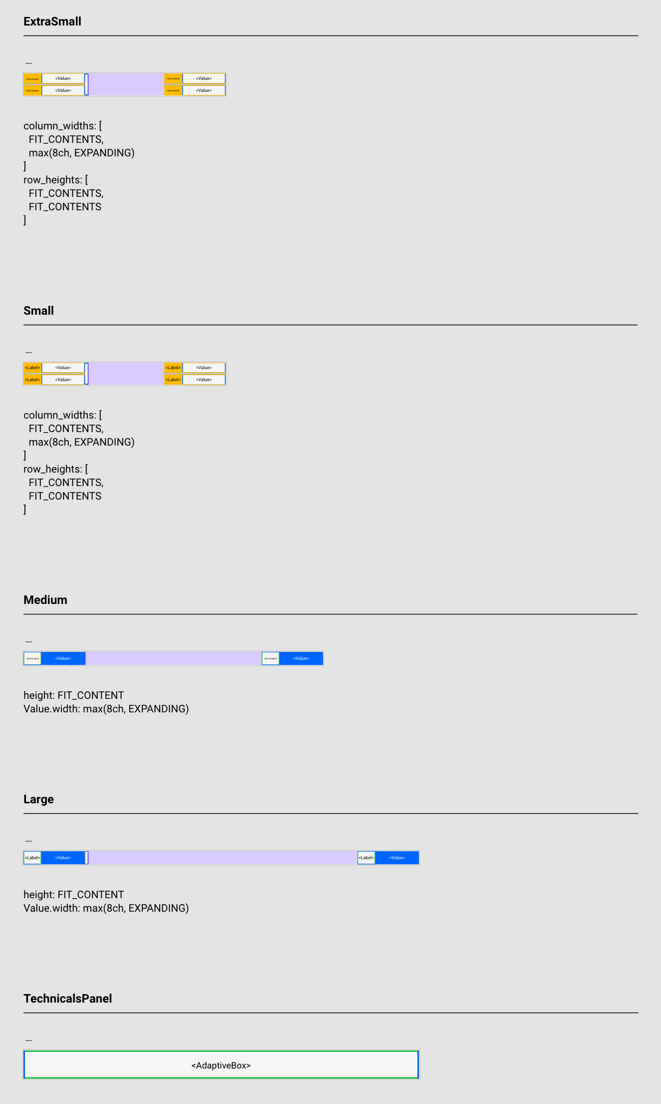
| 11:32, 19 March 2024 | TechnicalsPanel components.png (file) |  |
234 KB | Jon | Definition cards for the children of Technicals Panel in components.xd. | 1 |
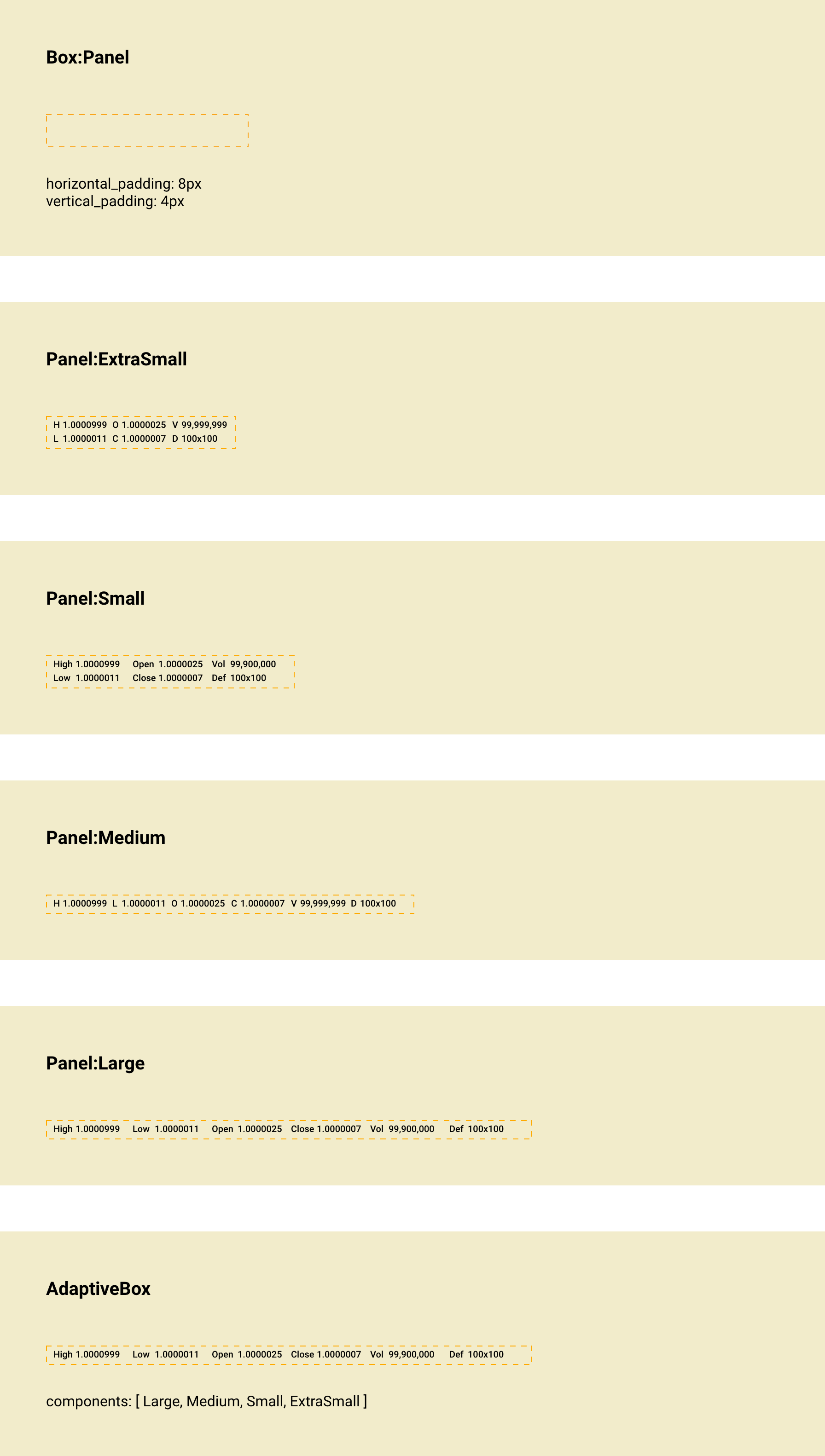
| 11:32, 19 March 2024 | TechnicalsPanel layout.png (file) |  |
145 KB | Jon | Layout for Technicals Panel component. | 1 |