Preview
preview.xd covers the visual overview of the component and its essential use cases. It provides the developer with a basic first impression of the component and helps them grasp the design intent. Any component with a visual representation requires preview.xd.
A good preview will:
- Document the component’s appearance and highlight its states
- Illustrate use cases visually that would be difficult to understand fully from other documentation
- Provide context, by showing places where the component is used by other components
preview.xd is non-normative. If there is a conflict between the appearance in preview.xd and subsequent specifications (e.g. components.xd or layout.xd) due to designer error, the other specifications take precedence. It is the designer’s responsibility to ensure that specifications are consistent and accurate.
Contents
Getting Started
preview.xd comes first in the specifications, at the end of all exploratory work and user research necessary to define the component. The preview informs the developer up front of what is being built. At a minimum the preview consists of a high-fidelity mock-up of the component that is a visual representation of the designer’s intent.
Use an existing file as a baseline. Start with an initial, default visualization of the component. Use cases may be shown as static visualizations. Keep each use case to its own row and show the next step in a use case in the adjacent column.
Example: HexColorBox
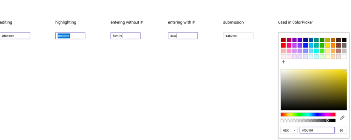
HexColorBox is a specialized input based on TextBox. Because TextBox functionality is documented in its respective preview, HexColorBox is primarily concerned with showcasing its unique features.
The preview communicates the following:
HexColorBoxis essentially aTextBox.- Hex values can be entered with our without a
#mark in front. - The submitted value always contains the
#mark in front. - It is used within
ColorPickeras an alternative input for color selection.
Anatomy
All preview.xd files contain a title block with the name of the component. Beneath it is the visual representation of the component in a default state. Other notable states are expected to be shown here as well, and may include:
openclosedhighlightedfocushoveractiveread_only
Provide text labels as identifiers for non-default states.
It is important to document the states that are specific to the component to serve as a reference not only for the developer building the component but also for the designer when assessing a completed component demo.
If the preview is including many states of its children, that is a clue that those children should probably be separate components with their own preview to cover these details.
Provide text labels as identifiers for use cases. Separate use cases into rows, providing a visual journey from left to right.
Example: TableView
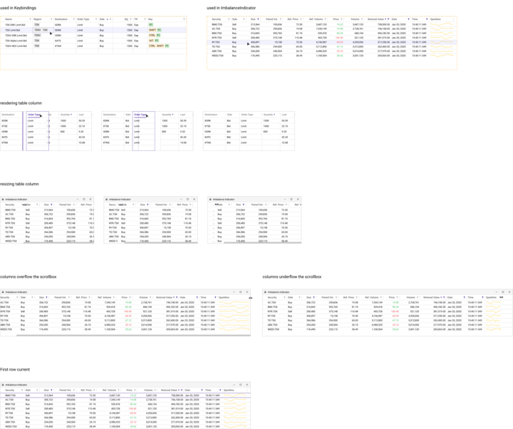
The preview showcases two places where TableView is used. There are some styling differences between the two, indicating that some customization is available. A variety of components are shown as table cells, with different styling, indicating that table cells are customizable without being an exhaustive enumeration.
Beneath the usages are rows for a few use cases and scenarios:
- Reordering a column
- Resizing a column
- Column overflow/underflow
- First row current
The use cases are divided into a few simple steps that are read left to right.
Note: Detailed state variations for the column headers and detailed state variations for cells are excluded - these are handled by the child components.
Example: Time and Sales Window
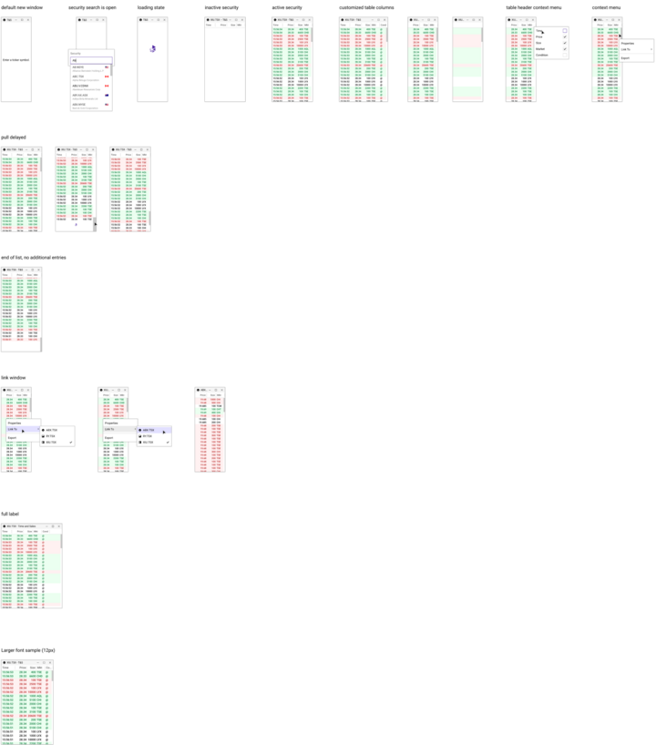
TimeAndSalesWindow showcases the possible variations for the window: - New window - Searching a security - Loading a security - Displaying an inactive security - Displaying an active security As well it shows customizations that can be made by the user for displaying columns.
Beneath the variations are rows for use cases and scenarios: pull delayed, no more entries, linking a window, displaying the full titlebar label, and displaying with a larger font. For pull delayed and link window, the steps are shown left to right.
The preview provides an overview of components acting together in sequence which is not shown in the isolated breakdowns in components.xd and layout.xd.
Example: FontBox
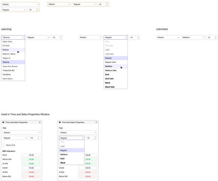
FontBox uses an adaptive layout that changes based on the available space. This is made apparent in the preview by showing the two different layouts while the particulars are delegated to components.xd and layout.xd. As a composite component, FontBox does not include all of the various states for its children.
Basic selecting and submitted states are shown to clarify its usage without specifying any novel behavior not covered by its children.
For context, FontBox is shown being used in TimeAndSalesPropertiesWindow.
What to Leave Out
Don’t include any text specifications in preview.xd (e.g. padding_left: 15px); these belong in components.xd.
For components that have adaptive layouts, do not include pixel breakpoints for different layouts. Layouts are specified in layouts.xd and the preview should be solely a visual reference in this regard.
Do not list children, these are enumerated in components.xd.
Usage
preview.xd is an important first step in specifying a component. A good preview synchronizes communication and understanding between designers and developers and provides a reference against which to compare the functioning final component.


