Layout
layout.xd defines the visual composition for a component and its child elements. It’s required whenever a new element arrangement is needed. layout.xd is not necessary when it inherits its layout from another component and does not modify that layout. For example, Label is a customized TextBox that makes no changes to the layout, so layout.xd is not needed.
This document is the go-to for widths, heights, and positions; it takes precedence in the event of conflicts with preview.xd or components.xd. However, dynamic adjustments tied to user input can override it, as specified in user_flow.drawio.
While components.xd outlines the parts of a component, layout.xd is about fitting these parts together. layout.xd answers the question: “What goes where?” It should include the following details:
- Position: Specifying where child components are positioned relative to each other.
- Size Policy: Define the size or proportions of child components and how they change with resizing.
- Spacing: Detailing the spacing or gaps between child components.
- Layer Hierarchy: How the elements of a child component are visually stacked.
Contents
Getting Started
layout.xd comes after preview.xd, model.txt, and components.xd. It is generally advised to ensure components.xd is finalized first, as the names defined there carry over to layout.xd.
layout.xd communicates spatial relations (position and size policy) through a primarily visual language. Each element is portrayed as a rectangle, with constraints along each edge indicated by edge color. When first learning the system, start by reviewing the layout reference document.
Before starting layout.xd, the visual design for all scenarios should already be worked out, with the key ones ideally captured in preview.xd. Use layout.xd to formalize the layout.
Sketch the component’s layout and that of each child at the preferred size. Maintain simplicity by restricting layouts to a single depth level; nesting layouts within layouts isn’t a convention in the visual layout language. If a child’s layout is specified elsewhere and remains unchanged, omit it. When included, consider it an override: the specified layout takes precedence over the existing one within the component instance.
Example: Slider
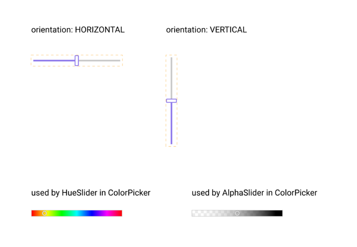
From the preview, we can see that Slider has a different layout depending on its orientation. Based on the examples, it appears that the thumb and the track are customizable.
Styles:
  orientation: The orientation of the slider.
    HORIZONTAL - The thumb can be dragged horizontally.
    VERTICAL - The thumb can be dragged vertically.

Data:
  current: The current value represented by the slider. Cannot be null.
           Defaults to halfway between min and max.
  min: The minimum value that current is allowed to be. Default 0.
  max: The maximum value that current is allowed to be. Default 100.
  step: The granularity that current must adhere to. Default 0.
  default_increment: The amount of change in current when the user increments or
                     decrements the slider.
  shift_increment: The amount of change in current when the user increments or
                   decrements the slider while holding the shift key.
  track: The component representing the track of the slider.
  thumb: The component representing the thumb of the slider.
 ...
The model for Slider shows a style orientation (HORIZONTAL | VERTICAL) corresponding to the preview. There are also two slots track and thumb, indicating that these are customizable.
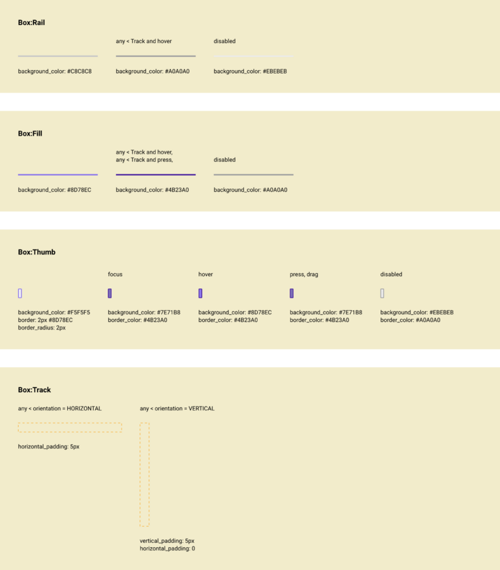
In components.xd, child names and styles are defined.
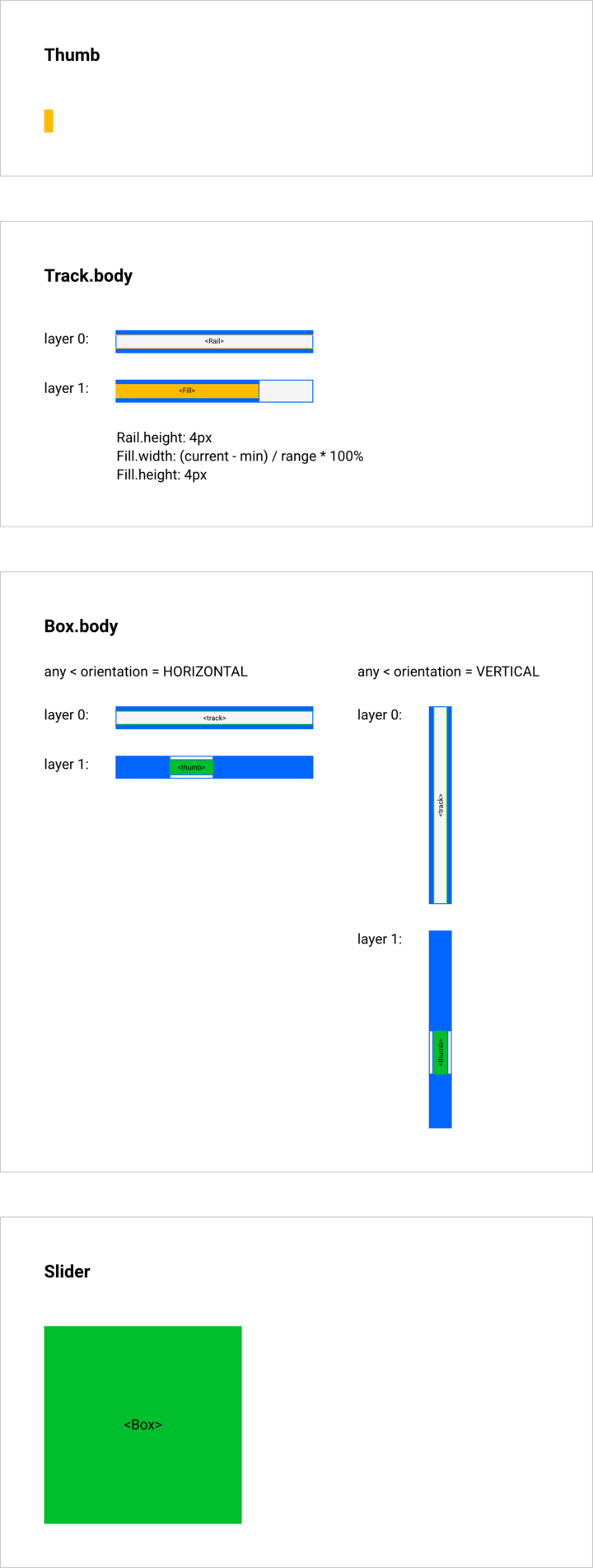
By contrast with components.xd, in layout.xd the bottommost (outermost) element receives the title of the component itself. This is necessary to clarify how the component’s children are arranged within it and to provide its size constraints. In the above, Slider is a Box that contains track on layer 0 and thumb on layer 1.
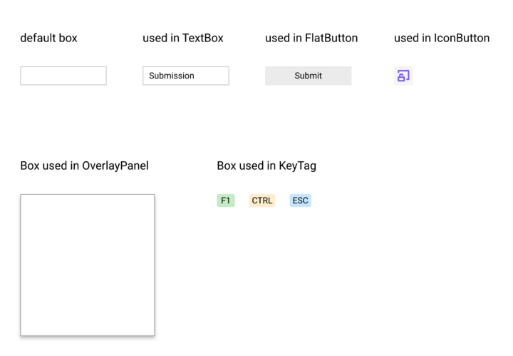
Note: The Box did not appear in components.xd as no customization is done to it, but it is required in layout.xd to define Slider. The use of Box means that components using Slider can customize it with Box-specific styling such as border, padding, and background_color.
Separate layers in Box.body allow for overlap between thumb and track. Similarly, two layers are used in the layout of Track.body for Rail and Fill. To avoid overriding Track’s layout, Track.body is laid out instead. Generally, when a component has slots, composition is done by laying out the slots without altering the overall layout.
The width of Fill is determined by an expression, creating a binding that updates with model property changes.
Thumb is laid out directly using absolute FIXED size. Here, an anonymous element is used to specify the size without overriding the layout.
To understand layout.xd, one must be familiar with Spire’s visual layout language.
Visual Layout Language
Within layout.xd, each element has a specific color and an identifier, rather than appearing as they do in preview.xd. These colors convey size constraints.
Elements
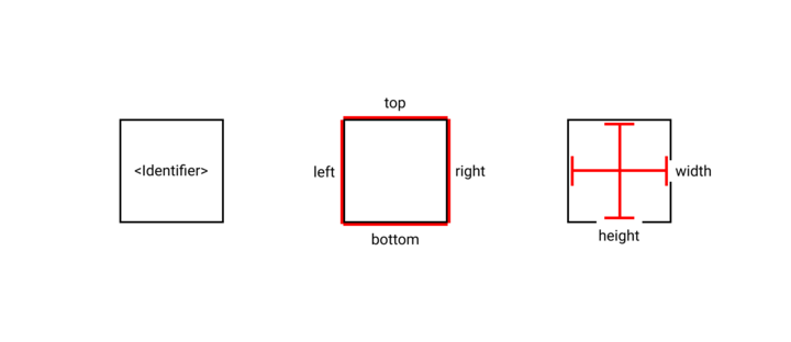
Layouts are composed of elements, representing components like Box or Button, spacers for visual separation, or containers strictly for layout. Elements are generally depicted as rectangles, with center-aligned identifiers like <ElementName>. The appearance of the identifier doesn’t align with text orientation within the element. An element without an identifier is anonymous. Each element can be thought of as having top, bottom, left, and right for its position and width and height for its size.
Size Constraints
Elements are sized through either fixed dimensions, expressed in pixels, or by occupying all available container space. An element’s size may also come from its contents, but ultimately any contents are either FIXED or FILL.
| Constraint | Meaning |
|---|---|
FIXED
|
The size of the component is a literal value that comes directly from the visual. An element drawn 12px wide is rendered 12px wide. As the size of the layout changes, the element size is unchanged. |
FILL
|
The size of the component fills the available space. The literal size of the depicted element represents the preferred size if no preferred size can be determined from the layout bottom-up. As the size of the layout changes, the element shrinks or grows to fill all available space. When multiple components in a layout have this constraint, the available space is distributed equally among them. |
FIT
|
The size of the component is determined by its contents. The literal size of the depicted element represents the preferred size if no preferred size can be determined from the layout bottom-up. This is often used for text which takes on a fixed value at any time, but changes dynamically or for windows that can be resized by the user and simultaneously restricted by their contents. |
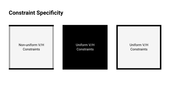
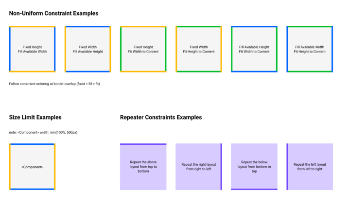
Uniform constraints (same in both axes) encode edges and background color with the appropriate constraint color. For non-uniform constraints, edges are color-encoded, and the background remains neutral. Optionally, a neutral background helps distinguish adjacent components with identical constraints.
Color-encoding for borders and backgrounds is as follows:
A Repeat element can be used to describe repetitive layouts. Repeat duplicates adjacent layouts, following the color-encoded Repeat Direction. It is useful for dynamic lists where the content dictates the number of items.
Example: Box
Box establishes the basic style properties. The relevant properties are detailed in model.txt:
Styles:
  border_top_size: The height of the top border.
  border_right_size: The width of the right border.
  border_bottom_size: The height of the bottom border.
  border_left_size: The width of the left border.
  ...
  padding_top: The amount of padding on the top of the box.
  padding_right: The amount of padding to the right of the box.
  padding_bottom: The amount of padding on the bottom of top of the box.
  padding_left: The amount of padding to the left of the box.
  ...

Data:
  body: The component displayed in the box.
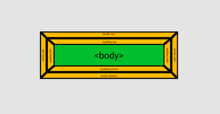
Box has a border, padding, and a body. border and padding are specified as fixed sizes for each edge, while body can be any component. layout.xd for Box shows how these elements are arranged:
In the layout, body adopts FIT constraints on all sides. By default, the size of the Box adapts to its content. padding is specified with separate components for each edge using FIXED constraints. border, akin to padding, uses the same specifications but lies outside it. The layout makes clear that border extends beyond padding, and both consume space that body cannot occupy.
Note: Box introduces a unique scenario as both border and padding elements converge at angles, presenting trapezoids instead of rectangles.
Position Constraints
The positioning of an element is considered relative to its container.
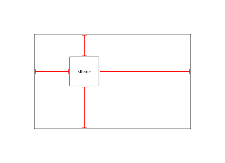
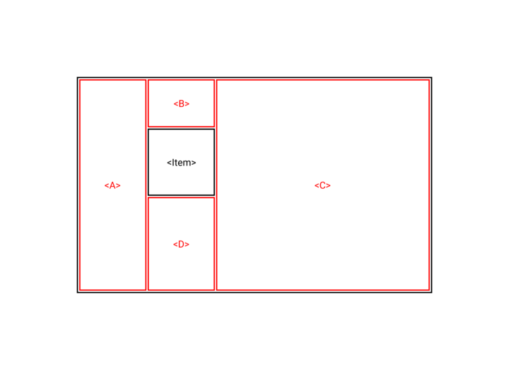
In the above diagram, the element Item is placed inside a container at some distances to its edges. Within the visual layout language, the layout must be drawn so that all of the space is taken up by elements, as shown below:
Above, the position of Item is defined by the surrounding elements A, B, C, and D. These elements can be other components or anonymous and they each have their own size constraints. How Item is positioned will depend on the size of the adjacent elements. The layout ensures no underflow, meaning no unoccupied space between components (the gaps shown in the diagram are for illustration only).
Edges of elements that touch are bound together. Where the right edge of A is adjacent to the left edge of B, it signifies A.right = B.left. Likewise, where the bottom edge of B aligns with the top edge of Item, it signifies B.bottom = Item.top.
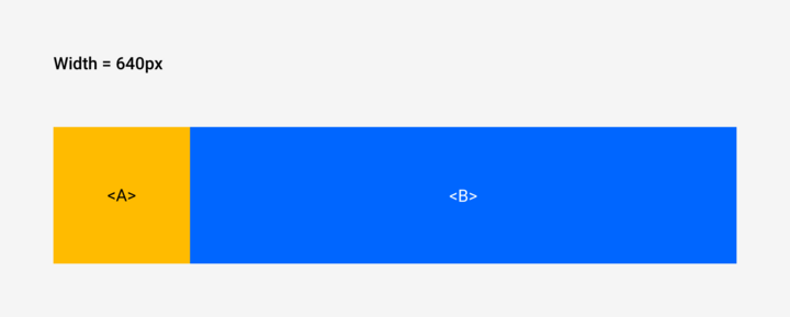
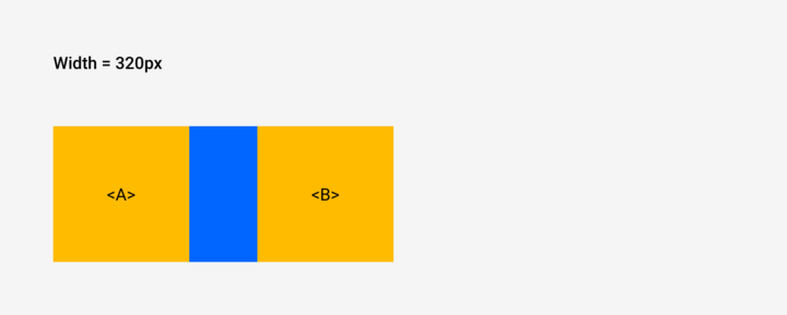
Example: A Fixed and B Fill
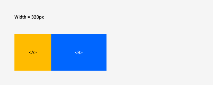
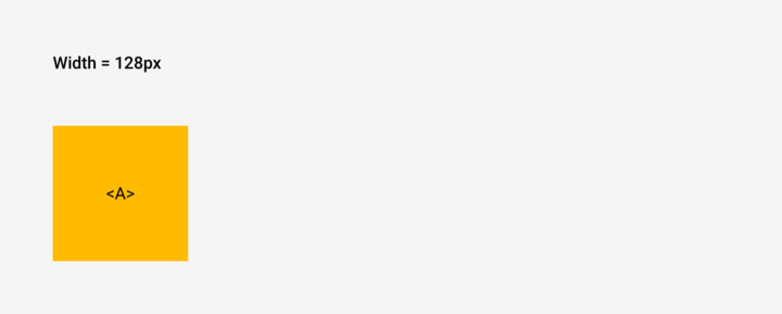
In this scenario, A is FIXED, signifying a literal size, while B has FILL constraints so that it occupies the available space.
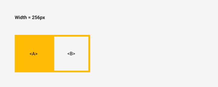
When the width is reduced, B goes to zero width:
When the width is increased, B stretches to fill the available space:
For the horizontal direction, the constraints are:
A.left = left
A.right = left + 128px
B.left = A.right
B.right = right
And in the vertical direction:
A.top = top
A.bottom = top + 128px
B.top = top
B.bottom = bottom
Since underflow is forbidden, the layout cannot exceed the height of A: there’s nothing to occupy the additional space.
Spacers
Negative space is specified with spacers — elements absent from components.xd and devoid of interactive and styling attributes. Spacers, often anonymous, serve the sole purpose of defining space between components.
Note: Negative space can also be introduced by using internal padding on adjacent components. Doing so is often preferred for FIXED spacing.
Example: A Fixed and B Fixed
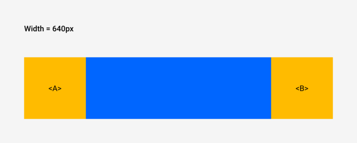
In this scenario, both A and B are FIXED, with literal sizes of 128px in width and height. They are positioned on opposite ends of the layout through the use of a spacer that is constrained to FILL the available space. The spacer lacks an identifier: it is anonymous.
When the width of the layout is reduced, the spacer collapses and A and B touch:
When the width of the layout is increased, the spacer expands to fill the available space:
For the horizontal constraints:
A.left = left
A.right = left + 128px
spacer.left = A.right
spacer.right = B.left
B.left = right - 128px
B.right = right
For the vertical constraints:
A.top = top
A.bottom = top + 128px
spacer.top = top
spacer.bottom = bottom
B.top = top
B.bottom = top + 128px
Containers
Layouts can be subdivided at the designer’s choosing using containers. They are used to encapsulate the arrangement of elements. Unlike spacers, containers cannot be anonymous; they require identification for referencing.
Example: ListView
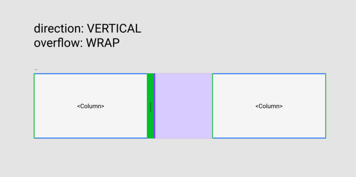
When direction = VERTICAL and overflow = WRAP , the layout is divided into containers named Column. Column is purely a layout element, without any representation in components.xd
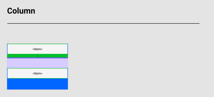
The layout for Column is shown the same as for any other component.
Example: TitleBar
From preview.xd, we can see that TitleBar consists of a few elements:
- Icon
- Title
- Window controls
- Container
The height of TitleBar is constant, while its width can vary.
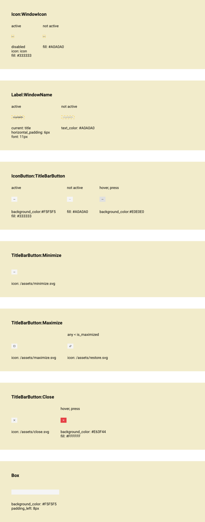
components.xd introduces aliases:
- WindowIcon
- WindowName
- Minimize, Maximize, and Close
- Box
Appearance tweaks—background colors, icons, and title text—are handled in the property declarations.
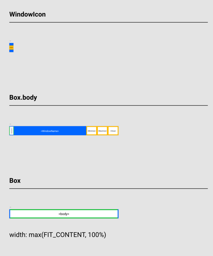
WindowIcon is an Icon with FIXED size of 10px that is vertically centered. Top and bottom spacers with FILL size ensure center alignment.
Note: Centering is indicated because the two elements are equally sized. Any positional bias could be provided by adjusting the relative sizes of the spacers.
The contents of TitleBar are arranged in Box.body:
WindowIconis given a vertical constraint ofFILLand a horizontal constraint ofFIT. It will be as tall as allowed byBoxand only as wide as required by its content.WindowNameis constrained vertically asFILLand horizontally asFILL, adapting to available space.Minimize,Maximize, andCloseare all given constraints ofFIXEDin height and width (22px x 26px). Their literal size is defined by the visual.
Box is the container with a vertical constraint of FIT and a horizontal constraint of FILL. An expression for width restricts its minimum size.
width: max(FIT_CONTENT, 100%)
This takes precedence over the sketch.
The layout ensures that TitleBar matches the width of its parent window without getting so narrow that the user is unable to interact with the controls.
Anatomy
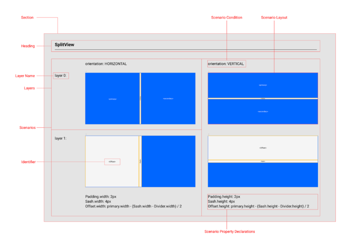
The structure of layout.xd is a vertical list of sections, each dedicated to the layout of a single element. Each section is divided into a grid with columns for scenarios and rows for layers and property declarations.
Example: SplitView
The heading is the name of the element being laid out.
Layers are stacked vertically in the column for a scenario. If only one layer is needed, the layer name is omitted.
When the scenario shown is the default condition, the scenario condition heading is omitted.
Each scenario and layer has a layout. Layouts are sketched at 1:1 scale.
At the bottom of each column are property declarations. These declarations supersede visual layout statements. They are useful for specifying sizes that are impractical to depict visually and for incorporating expressions.
Heading
The heading identifies the element that is being laid out. If an alias is assigned in components.xd, the alias is used.
Scenarios
Scenarios are used to create conditional layouts. While the presence or absence of components can be handled in components.xd using the visibility property, specific positioning of children must be specified in layout.xd
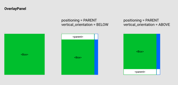
Example: OverlayPanel
Data:
  parent: The component that showed the OverlayPanel.
  ...
  positioning: Specifies the positioning of the panel relative to the parent:
    NONE: The panel is not positioned relative to any other component.
    PARENT: The panel is positioned relative to the parent. Default.

State:
  vertical_orientation: Whether the OverlayPanel is placed above or below the
                        its parent, this is determined based on the position
                        of the parent and the size of the body. If the body
                        can fit entirely below the parent then the orientation
                        will be BELOW, otherwise it will be ABOVE.
    BELOW: The OverlayPanel is below the parent.
    ABOVE: The OverlayPanel is above the parent.

...
OverlayPanel has a conditional layout based on whether the panel is: - default - positioning = PARENT and vertical_orientation = BELOW - positioning = PARENT and vertical_orientation = ABOVE
These are the scenario conditions.
Scenario evaluation follows a right-to-left (and bottom-to-top if applicable) sequence: the first matching scenario takes effect. In the OverlayPanel example, the match depends on parent’s location relative to the screen and the size of Box.
Scenario conditions are written using selectors. Refer to the documentation for selectors on components for details on using selectors to specify a condition.
Layers
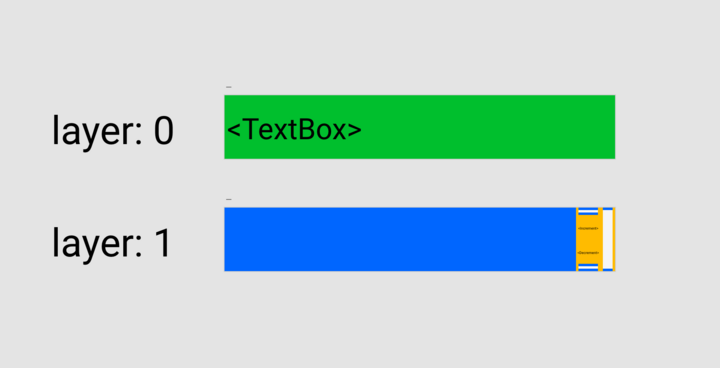
Layouts can be separated into layers. This is done by prepending layer n: before the layout, where n is the layer number. Layers are zero-indexed and arranged vertically from bottom to top. Lower layers have z-priority.
Layers are useful for specifying where components need to overlap.
Example: DecimalBox
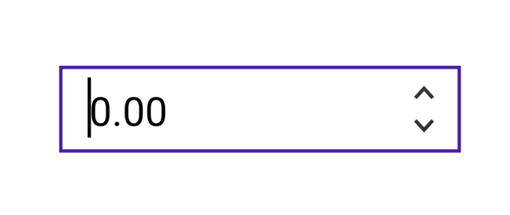
A TextBox is placed on layer 0 while the step buttons Increment and Decrement are placed on layer 1. This allows the step buttons to be visually nested in the TextBox without modifying the TextBox layout.
Layout
The layout is a 1:1 scale sketch of the scenario using the visual layout language. The size used to represent a layout is the preferred size.
Through the use of the visual layout language and property declarations, the layout fully specifies the positions and sizes of an element’s children for all possible sizes of the element.
Identifier
Each element is labeled with an identifier. The identifier is shown in angle brackets as <ElementName>. Naming follows the PascalCase convention from components.xd.
When an identifier matches the name of an existing component, the layout is for an instance of that component.
Slots, components specified in model.txt under Data, earmark children open to substitution with different components. When identifying slots, the snake_case convention from model.txt is used.
When an identifier does not match a component name or a slot, the layout is for a spacer or a container used for organizational purposes within the document.
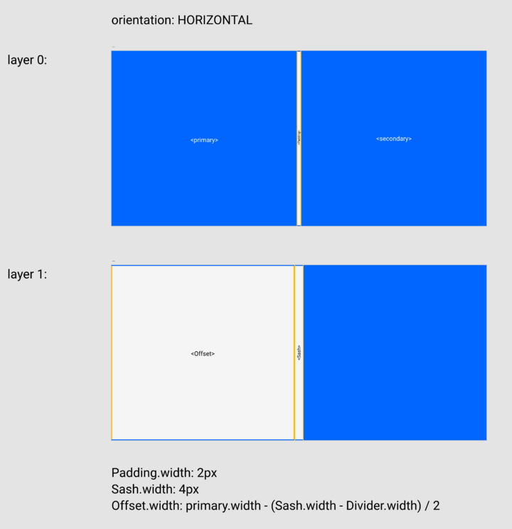
Example: SplitView
The model for SplitView shows two slots: primary and secondary.
...
Data:
  primary: The primary pane.
  secondary: The secondary pane.
...
In layout.xd, these are represented as <primary> and <secondary>.
Additionally, three named elements are depicted—Padding, Offset, and Sash. These lack correspondence to any components or slots and serve as reference points for property declarations.
While Padding is intended to be 2px wide, it’s shown at an enlarged size for readability. The declaration is used to provide the true size. A similar approach applies to Sash.
Multiples
In a component, you might have several instances of the same type, and their layouts could be identical. In such cases, the element identifiers in layout.xd drop the index found in components.xd.
Example: ListView
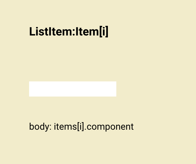
In components.xd there is a child Item[i], as there are multiple Item children depending on the data given to ListView.
However, in layout.xd, we simply use Item without an index in the identifier. Because the layout is positioning the items, specific index values would not accurately convey our intent. Instead, the Repeat element is used to signify repetition and dictate the direction.
Property Declaration
Property declarations take precedence over the visual layout. Properties come from the child being defined. To understand what’s available, consult its model.txt. Generally, only size and position properties, such as width, height, and position should be declared in layout.xd.
The key properties are as follows:
| Property | Definition |
|---|---|
width
|
The width of the component in pixels. |
height
|
The height of the component in pixels. |
position
|
The position of the component relative to its parent, if the component has no parent, then the position is equal to screen_position.
|
x The x-coordinate in pixels.
| |
y The y-coordinate in pixels.
|
Property declarations are made using expressions which support basic mathematical operators (+, ×, /, -) and various functions. These are used for more complex constraints that are not easily visually represented.
A fluid layout with a minimum width of 20px and a maximum width of 100px can be specified as:
width: clamp(20px, FILL_AVAILABLE, 100px)
The preferred size is the middle value (FILL_AVAILABLE), but it is bounded by 20px and 100px on either side.
Expressions containing dependencies establish a binding.
Offset.width: primary.width - (Sash.width - Divider.width) / 2
Whenever primary.width changes, Offset.width will also change.
Expression Values and Units
Expressions use a fixed set of units and preset values.
| Unit / Value | Description |
|---|---|
n px
|
A literal amount in pixels |
n ch
|
The width of the “0” character for the element font. A width value of 6ch is approximately 6 characters wide in the specified font.
|
n em
|
Represents the calculated font size of the element. |
n %
|
A percentage amount relative to the immediate parent layout |
FILL_AVAILABLE
|
Fills its parent |
FIT_CONTENT
|
Fits its contents |
Additional units may be used provided they have compelling use cases and are documented. The above units come from CSS
Expression Functions
Any function can be used in an expression provided its definition is provided or it is sufficiently self-explanatory. In practice, it is best to stick to a limited set of functions. The following have been used in layout specifications:
| Function | Description |
|---|---|
min(a, b)
|
The minimum of a and b
|
max(a, b)
|
The maximum of a and b
|
clamp(lower, value, upper)
|
value, clamped to between lower and upper (inclusive)
|
These have CSS equivalents:
Expressions can also be set to animation values as outlined in the documentation on Animations.
Example: DropDownList
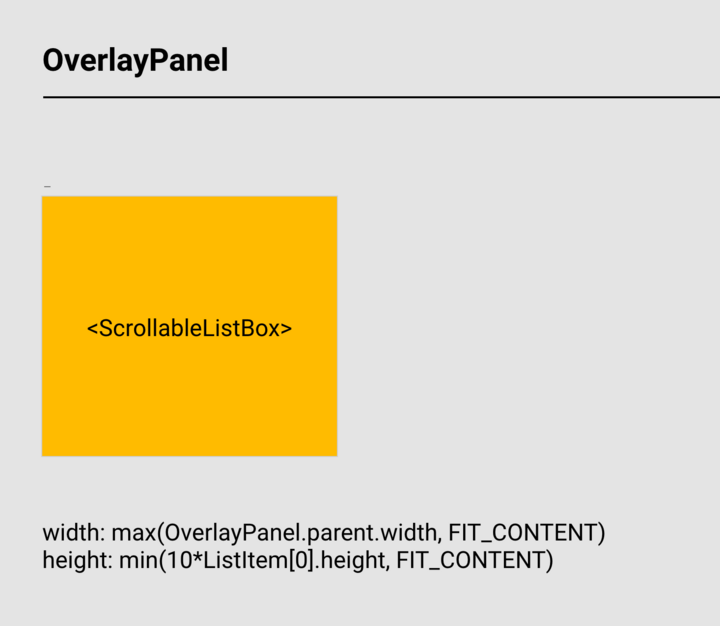
DropDownList sets the width to the greater of its parent’s width or the content width of the ScrollableListBox. The height is set dynamically to display either ten items or all available items, whichever is less.
Ordering
When structuring layout.xd, maintain an order mirroring components.xd—from innermost to outermost. This ensures clarity and consistency.
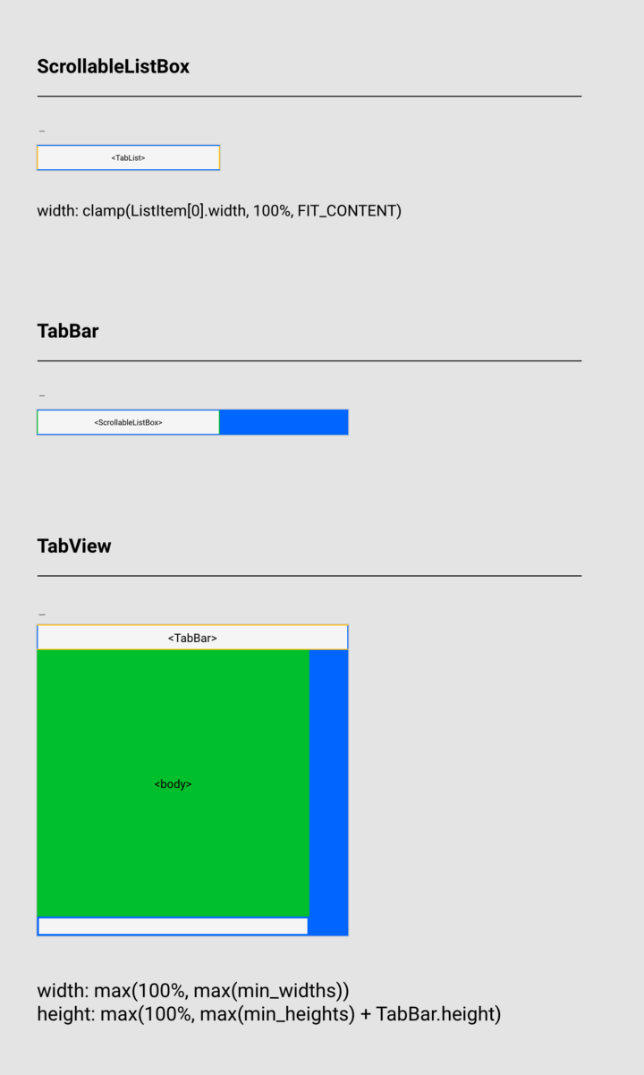
Example: TabView
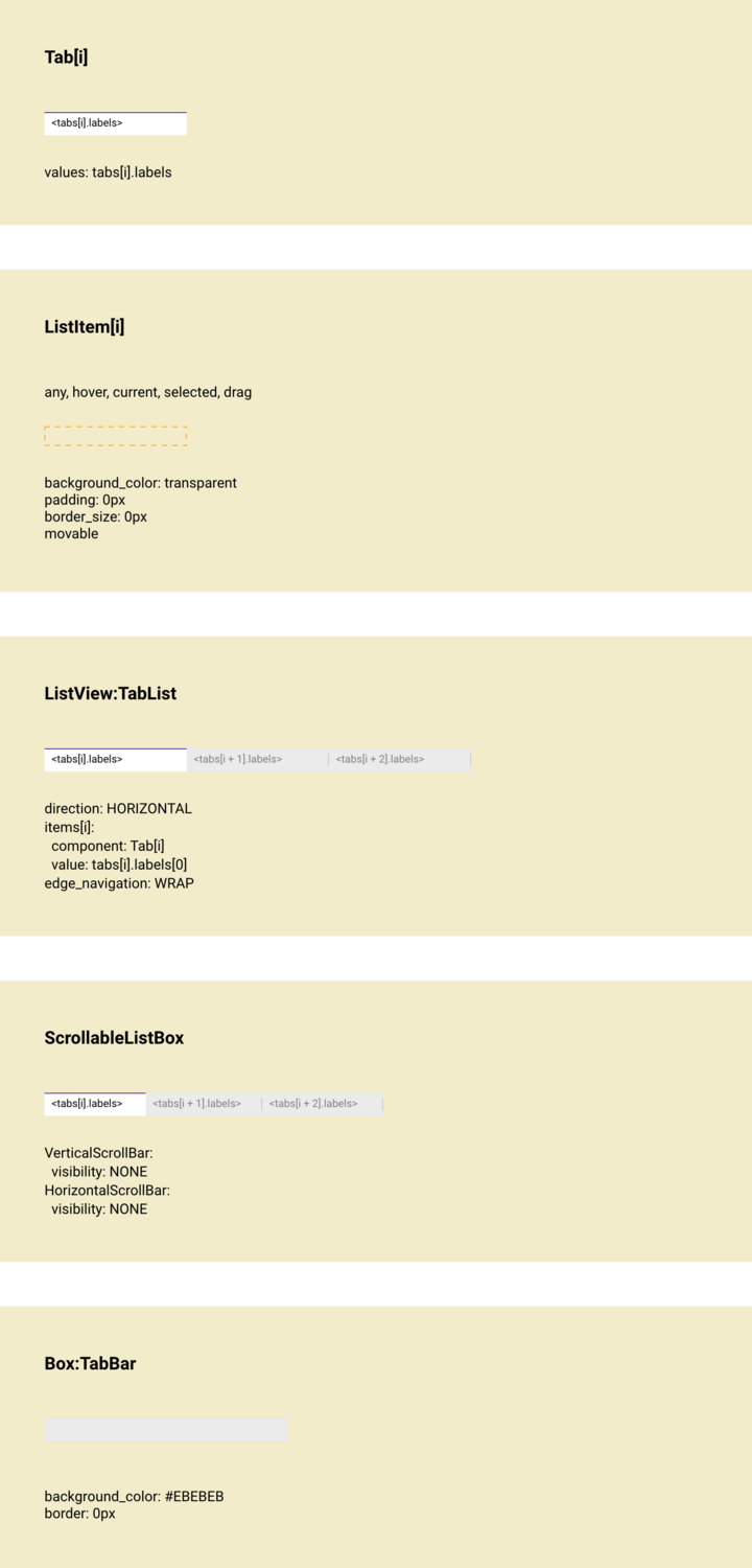
components.xd lists a Box, a ScrollableListBox, and a custom ListView that uses a Tab component for each ListItem.
From top to bottom, the order is:
- Tab[i]
- ListItem[i]
- ListView:TabList
- ScrollableListBox
- Box:TabBar
layout.xd lays out TabView as TabBar and body, along with two spacing elements. TabBar is laid out as ScrollableListBox and a spacer, and ScrollableListBox is laid out as TabList.
From top to bottom, the order is:
- ScrollableListBox
- TabBar
- TabView
Unlike components.xd, TabView itself is included in layout.xd. As in components.xd, ScrollableListBox comes before TabBar as the order moves from innermost to outermost. While components.xd lists TabList, ListItem[i] and Tab[i], they are absent from layout.xd. As these components all specify their layouts and TabView does not override any of these layouts, they are omitted.
Referencing
In property declarations, only elements positioned higher in the document can be referenced.
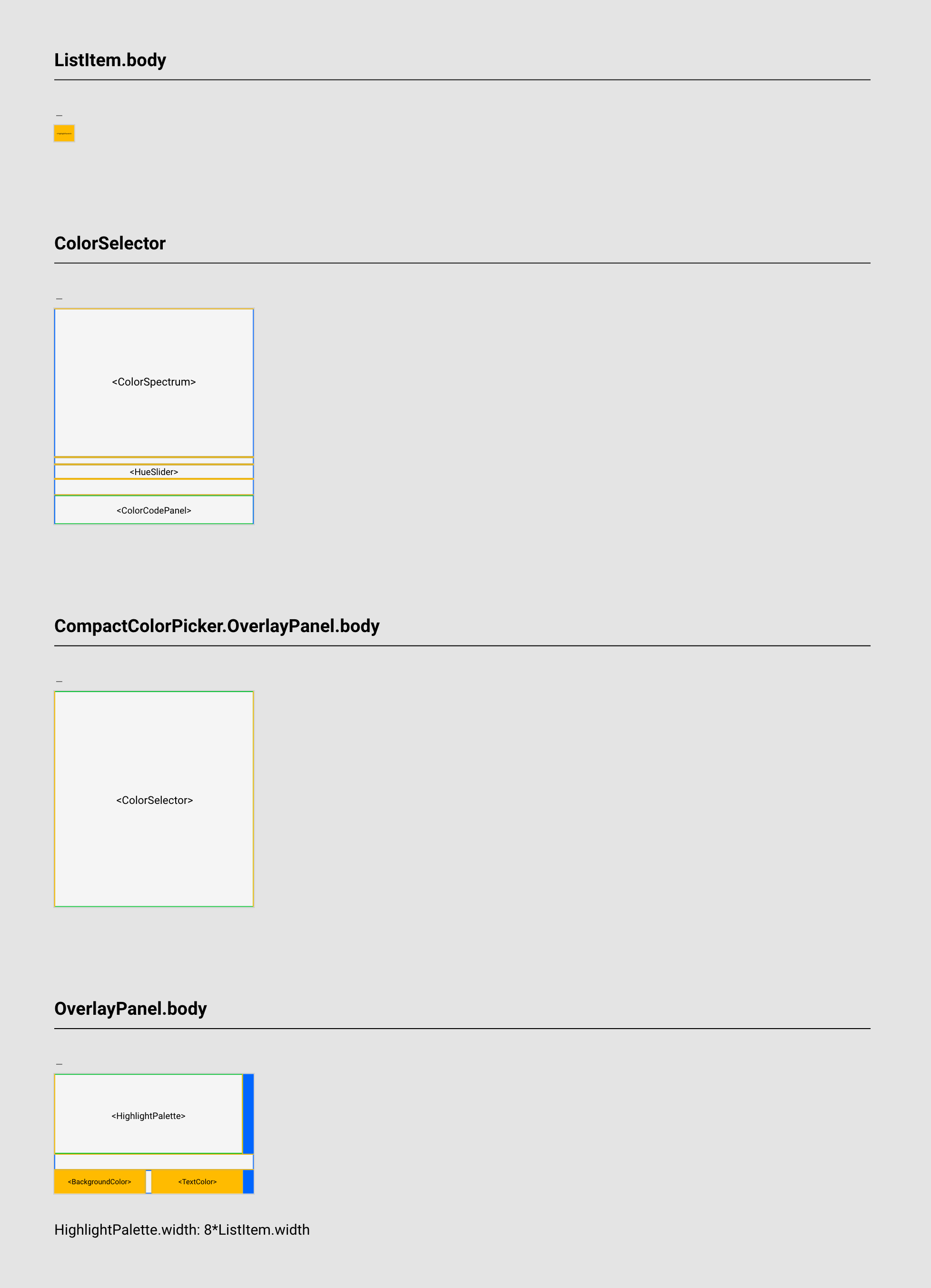
Example: HighlightPicker
The property declaration in OverlayPanel.body references the width of ListItem:
HighlightPalette.width: 8 * ListItem.width
This is a valid reference, as ListItem is a child of OverlayPanel.body so the layout for ListItem.body comes above that for OverlayPanel.body.
Adaptive Layouts
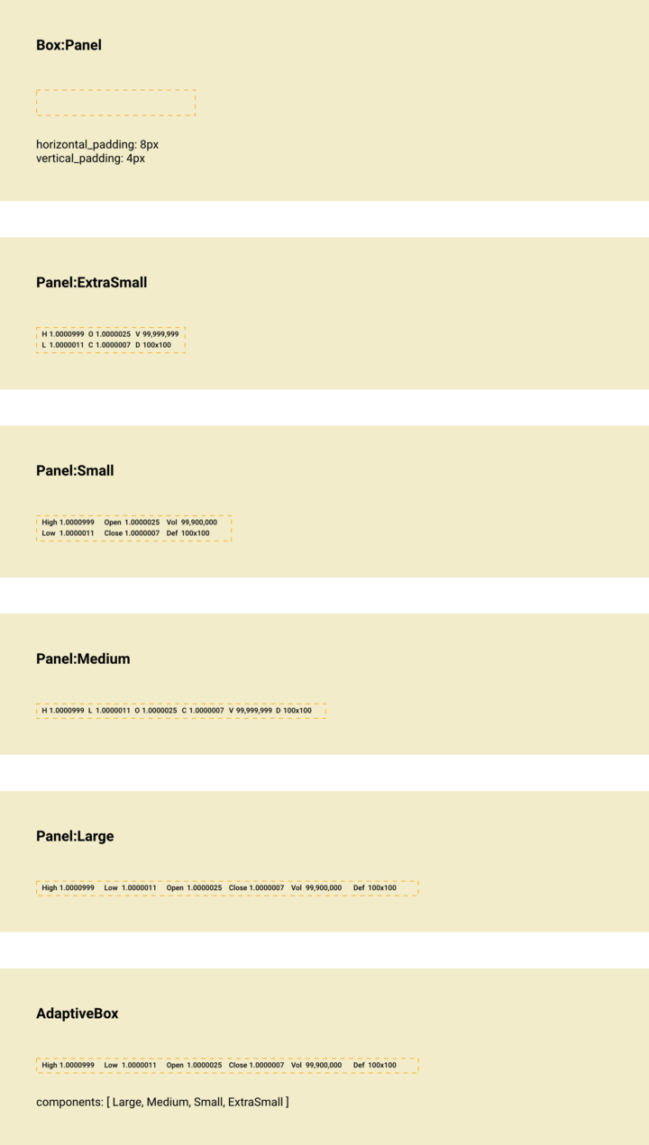
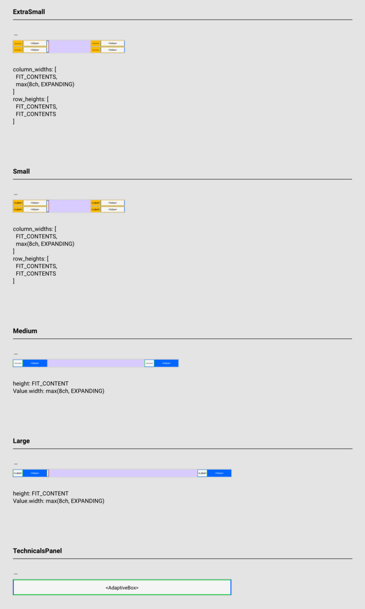
Sometimes it is necessary to specify a different layout according to the available space. Instead of a gradual transition of elements, a step-change may be appropriate such as switching between an even grid and a linear arrangement, or switching labels between a long-form and a short-hand. Consider the TechnicalsPanel from BookView:
The six technical indicators High, Low, Open, Close, Def, and Vol are shown stacked in a 3x2 grid or linearly as a 6x1 row. They are also shown either as a full name (e.g. High) or an abbreviation (e.g. H). There should be a step-change between the 3x2 and 6x1 arrangements, as a partially filled second row makes for more difficult reading. There should also be a step-change between full labels and abbreviations, since if the labels are not coordinated it becomes visually confusing.
This behavior is not specified directly in the visual layout language. Instead, a purpose-built component AdaptiveBox is used.
To use AdaptiveBox, the designer specifies each layout within components.xd. It is convention to use size-based naming: ExtraSmall, Small, Medium, Large, but this can be adjusted to suit the specific use-case. AdaptiveBox is placed in components.xd and its components property is set to a list containing the named layouts.
The components are listed in order of largest size to smallest size when passed to AdaptiveBox. Within layout.xd, the layout for AdaptiveBox and each layout in layouts is specified.
AdaptiveBox then manages which layout is displayed based on the available space. There is no specifying of fixed-pixel breakpoints.
Usage
When laying out children from components.xd that have been assigned an alias, use the alias to title the layout. When laying out a component slot, use dot notation to title the slot (e.g. Box.body) and avoid repeating the layout for the component itself.
layout.xd is used to bring a component together, formalizing the position and size relations of it and its children. Approach layout.xd after fully utilizing components.xd to enumerate the component’s children and with a firm understanding of how the component will adjust at different sizes.

